February 12, 2026
There’s a special kind of magic in watching watercolour pigments bloom across damp paper, mimicking the slow unfurling of a petal. If you've ever felt drawn to this fluid, beautiful art form, you're in the right place. This guide is your gentle introduction to the craft, designed to demystify the process and get you started on your own artistic journey with confidence.
Painting flowers is an endlessly rewarding subject. Each blossom offers unique shapes, colours, and textures, providing a constant wellspring of inspiration right from your own garden or local florist. Better yet, the skills you'll develop aren't just for paper; they connect to a rich history of decorative arts.
Many folk art traditions, from Scandinavian rosemaling to intricate botanical illustrations, are rooted in the beauty of the natural world. Learning to paint flowers with transparent pigments gives you a foundational skill set that you can adapt to all sorts of creative projects.
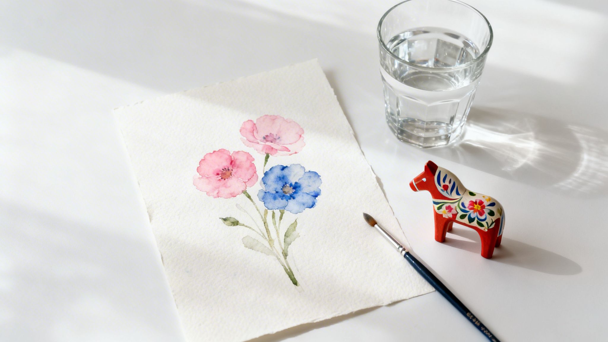
Imagine translating these delicate floral motifs from paper onto different surfaces. The techniques for creating soft petals and crisp leaves are the very same ones you can use to personalise unique items, like one of our Dalaart wooden horse models.
The real beauty of learning this skill is its versatility. A simple painted rose on paper today can become a personalised motif on a wooden keepsake tomorrow, connecting your new hobby to timeless traditions of craftsmanship.
This approach transforms your artistic practice from simple exercises on a page into the creation of meaningful, tangible heirlooms.
For anyone new to watercolours, flowers are an ideal starting point. They are wonderfully forgiving subjects and offer incredible variety that will keep you captivated.
This guide will walk you through everything you need to know, focusing on the pure joy of creation. Let's get started on this artistic adventure together.
Before you can bring a delicate flower to life on paper, your first creative step is gathering the right tools. The world of art supplies can feel a bit overwhelming, I know, but you only need a few key items to get started on your watercolour flower painting journey. The goal isn't to buy the most expensive gear; it's about choosing supplies that will work with you, not against you.
Making these initial choices thoughtfully really does set the stage for your success. Good materials let the watercolour do its beautiful thing—flowing, blending, and layering just as it should—making the whole experience more enjoyable from your very first brushstroke.
One of the first decisions you'll make is about your paints. Generally, you'll see two main categories: student-grade and artist-grade.
Student-grade paints are definitely easier on the wallet because they contain more fillers and less pure pigment. While they’re perfectly fine for your first practice runs and getting a feel for colour, you might notice they can look a bit chalky or less vibrant once they dry.
Artist-grade paints, on the other hand, are packed with a higher concentration of finely ground pigment. This is what gives you those brilliant, luminous colours that layer so transparently. They also have much better lightfastness, which simply means your beautiful paintings won't fade over time.
My personal tip? Start with a small, limited palette of primary colours in artist-grade quality. Investing in a really good red, yellow, and blue forces you to learn colour mixing from the get-go and gives you a much better feel for how high-quality pigments behave.
If there’s one place I always tell people not to cut corners, it’s the paper. Trying to use standard printer paper for watercolours will only lead to frustration—it’ll buckle, pill, and pretty much fall apart the second it gets wet.
For anyone starting out, 140 lb (300 gsm) cold-press watercolour paper is the absolute sweet spot. Here’s why it’s my go-to recommendation:
This type of paper is literally designed to handle all the techniques you'll be learning. As you start exploring, you'll find that most online tutorials and workshops also recommend this standard, making it much easier to follow along and get similar results. You can find out more about different techniques from watercolour painting courses and get a spark of inspiration for your own work.
You absolutely do not need a massive collection of brushes to paint beautiful flowers. In fact, just a few versatile shapes will cover almost everything you need to do. I'd suggest focusing on a small set of quality synthetic brushes—they’re durable, hold their shape well, and are more affordable than natural hair.
A fantastic starting trio would be:
With these three tools, a small palette of quality paints, and the right paper, you have everything you need. You're officially ready to start your watercolour adventure.
Alright, with your creative toolkit all set up, we can finally move from theory to practice. This is where the real fun of watercolour painting flowers begins—learning the essential strokes that are the building blocks of every single floral you'll paint. With just a little bit of practice, these foundational movements will start to feel like second nature.
The secret to beautiful floral watercolours is all about understanding the delicate dance between your brush, the pigment, and the water. It’s a relationship that's incredibly rewarding once you get the hang of it. We’ll start with the most basic, yet vital, techniques.
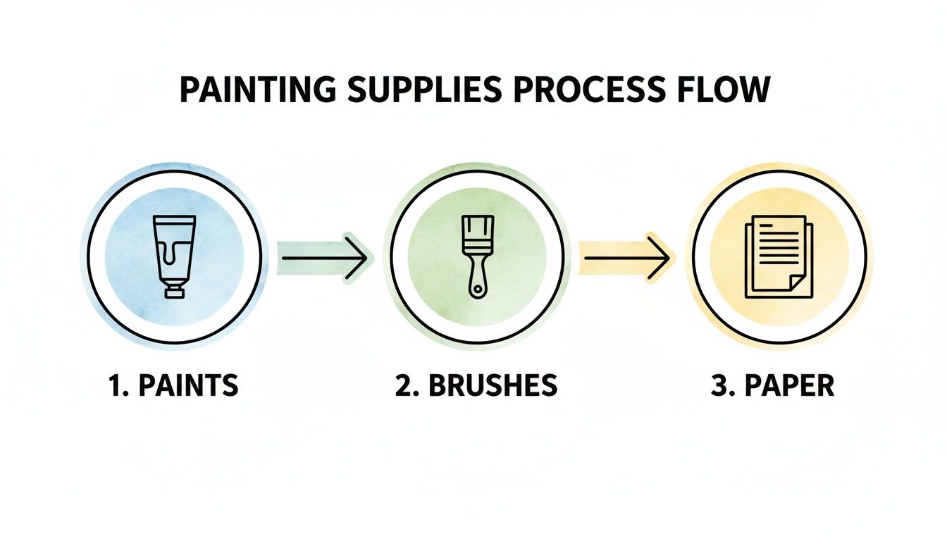
This little flow chart just reminds us how each element—the paints, brushes, and paper—plays an equally important role in whatever you create.
The heart of painting flowers is capturing the organic, flowing shapes of petals and leaves. For these strokes, a good round brush is going to be your absolute best friend.
For a Simple Petal: Load up your size 8 round brush with a nice amount of colour. Start by pressing the tip down gently, then apply a bit more pressure to flatten the belly of the brush against the paper. Finally, lift the brush back onto its tip as you finish the stroke. This single "press and lift" motion creates a lovely, natural teardrop shape.
For a Slender Leaf: You’ll use that same "press and lift" technique, but this time, make the stroke longer and more curved. I even like to add a slight wiggle to my hand to create a more natural-looking leaf edge.
For a Delicate Stem: Grab your smaller round brush (a size 4 is perfect for this) and use just the very tip. Hold it almost vertically and draw a light, consistent line. Don’t worry about making it perfectly straight; a little wobble adds character and realism.
Washes are the thin, transparent layers of colour that form the very foundation of your painting, from soft, dreamy backgrounds to the crispest details. The two most important washes you need to master are wet-on-wet and wet-on-dry.
The real magic of watercolour is in its transparency. Mastering washes lets you build depth and luminosity, allowing the light of the paper to shine right through your layers of colour. This is what gives floral paintings their signature glow.
Each of these techniques produces a completely distinct effect and is used for different purposes in your artwork.
The wet-on-wet technique is absolutely perfect for creating those dreamy, diffused backgrounds or soft, blended petal effects. You achieve this by first painting an area of your paper with clean water, then dropping your chosen pigment right into that damp area.
You'll see the colour bloom and spread beautifully, creating soft, unpredictable gradients. This method is fantastic for suggesting a cluster of distant flowers without having to paint every single detail. Just be mindful that you have less control here—so learn to embrace the lovely little accidents that happen!
On the flip side, the wet-on-dry technique is all about applying wet paint directly onto dry paper. This gives you maximum control and results in crisp, well-defined edges.
This is the technique you'll turn to for painting individual petals where you want a clear separation from the background, or for adding sharp details like the tiny veins on a leaf. It’s your go-to method for layering colours and building up form with real precision. For a bit more inspiration on form, take a look at our guide on creating beautiful flower line drawings, which can be a fantastic foundation for your paintings.
Once you’ve got a feel for the basic shapes, the real fun begins: breathing life and personality into your watercolor painting flowers. This is where we move past simple practice strokes and start telling a story with colour and texture, turning a simple study into a captivating piece of art.
The secret isn't complicated, but it does take a bit of finesse. It all comes down to two things: thoughtful colour mixing and the delicate art of layering transparent washes, a technique we call glazing. Get these right, and you'll build rich, believable tones and shadows without ever making your painting look muddy.
One of the most rewarding parts of watercolour is mixing your own unique shades. If you start with a limited palette—a good red, yellow, and blue, for instance—you’re forced to really understand how colours play off one another. This little trick is what leads to a much more cohesive and professional-looking painting. After all, you’ll quickly discover that nature rarely gives us a colour straight out of a tube.
Let’s talk about mixing a natural green for your leaves and stems. Instead of just mixing blue and yellow, try adding a tiny touch of burnt sienna to your ultramarine blue first. This small step tones down the electric brightness, creating an earthy, realistic green that will sit beautifully next to your flower petals. The same idea applies to your blooms; a whisper of a complementary colour can create the most stunning, subtle variations. You can dive deeper into this by checking out our detailed guide on mastering your color mixing chart.
Remember, the goal isn't just to match a colour, but to create a relationship between all the colours on your page. A harmonious palette, mixed from just a few core pigments, makes every element feel like it belongs.
Glazing is really the heart and soul of traditional watercolour. It's all about applying very thin, transparent washes of colour over a previous layer that is completely dry. This is how you build up that wonderful richness and create the illusion of three-dimensional form, all while letting the bright white of the paper shine through.
Imagine you're painting a rose. You might start with a very light, watery wash of pale pink across the whole flower. Then, you have to wait. Once it's bone dry, you can come back in and glaze a slightly darker, more concentrated pink into the areas where petals overlap or curve away from the light. Each transparent layer optically mixes with the one beneath it, creating a depth that one thick, flat layer of paint could never achieve. This method requires patience—you absolutely must let each layer dry—but the luminous results are always worth it.
I've always found that the final 10% of the painting process makes 90% of the impact. These are the small, deliberate details that truly bring your subject to life and guide the viewer's eye exactly where you want it to go.
Delicate Veins: Grab your smallest round brush (a size 4 is perfect for this) and use the very tip to paint fine veins on your leaves. Mix a slightly darker shade of your leaf green, and remember to keep the lines light and organic—nature is rarely perfectly straight.
Defining the Centre: The centre of a flower, with its stamens and pollen, is a fantastic focal point. Use a thicker, more opaque mix of yellow ochre or burnt sienna, and apply it with little dots or tiny strokes to build up texture and draw the eye inward.
Tiny Highlights: Since we rely on the paper for our whites, you can "lift out" small highlights for a soft, natural look. While a petal is still just slightly damp, take a clean, thirsty brush (dab it on a paper towel) and gently touch the area where you want a highlight. The brush will wick away some of the pigment, leaving a beautifully soft, lightened spot.
These are the final touches that elevate your watercolor painting flowers from a simple practice piece to a finished work of art, full of life and delicate complexity.

Now for the really fun part. You've practised on paper, honed your skills, and it's time to bring those beautiful floral designs to life on a truly unique, three-dimensional canvas. Applying your new watercolor painting flowers techniques to a Dalaart horse or another one of our wooden models is an incredibly rewarding project that connects you directly to a rich history of folk art traditions.
But before you jump in, it’s important to know that painting on wood isn’t quite the same as painting on paper. Wood is naturally porous and will drink up watercolour paint in an instant, leaving you with dull, faded-looking results. To get that vibrant finish you’re aiming for, proper preparation is everything.
Before a single drop of colour touches the wood, you have to prime the surface. This is non-negotiable! Applying one or two thin coats of white gesso is the most critical step. Gesso is a special primer that seals the wood, creating a stable, non-absorbent surface for your paint to sit on.
Think of it as giving your wooden model its own custom-fit sheet of high-quality paper. This preparatory layer ensures your colours stay bright and true, allowing you to build up layers and blend your paints much like you would on paper. Just be sure to let each coat of gesso dry completely before you start painting.
Painting on the curved form of a Dala horse is a wonderful design challenge. You’re no longer working with a flat composition; instead, you need to think about how your floral motifs will wrap around and complement the shape of the horse.
This process becomes a beautiful blend of your personal style and the object's inherent character.
While you can absolutely use watercolours on a gessoed surface, you might find that more opaque paints like gouache or acrylics are better suited for wood. Gouache offers a lovely matte finish similar to watercolour but has much stronger covering power, which can be a real advantage.
Acrylics are probably the most popular choice for decorating wooden objects. They’re durable, vibrant, and dry to a permanent, water-resistant finish, making them ideal for an object that might be handled or displayed for years to come.
This is a great opportunity to experiment. All your new knowledge of floral shapes, composition, and colour mixing will translate perfectly to these other media. For smaller projects, you could even adapt these techniques for other DIY items. We have some great ideas in our guide to creating a personalized key ring.
Finally, once your masterpiece is completely dry, you must seal your work. Applying two or three thin coats of a clear acrylic sealer or varnish will protect your beautiful artwork from dust, moisture, and fading. This final protective layer is vital for preserving your hard work and ensuring your personalised Dalaart model can be cherished for years.
As you start exploring the beautiful world of watercolour painting flowers, you're bound to run into a few tricky spots. It happens to everyone! Think of this as a chat with a friend who’s been there, ready to help you navigate the most common hurdles beginners face with some simple, practical advice.
This is probably the number one frustration I hear about. You have this beautiful, vibrant colour on your palette, but on the paper, it just looks… well, muddy. This almost always comes from one of two things: overworking an area while it’s still wet, or not letting layers dry in between.
The trick is learning the art of glazing. You lay down one wash of colour, then you go make a cup of tea. Seriously. Let it dry completely before you even think about adding the next layer.
The most important lesson in watercolour is patience. If you rush, the colours will bleed together uncontrollably. But if you wait, you can build luminous, transparent layers that give your flowers life.
Another common question is how to fix those little accidents. Unlike forgiving mediums like acrylic, watercolour can be a bit stubborn once it's on the paper. But don't despair; you have a few options for small mishaps.
If you’ve put down a stroke that's too dark or it's gone somewhere you didn't intend, speed is your friend. While the paint is still wet, grab a clean, "thirsty" brush (one that's just slightly damp) and gently lift the pigment right off the paper. It works like a tiny sponge.
What if the paint is already dry? You can still salvage it. Re-wet the area with a clean brush and carefully dab it with a paper towel. This blotting technique won't erase the paint entirely, but it can lighten the area significantly, often saving your painting from the bin.
This is a crucial one, especially for capturing bright highlights or painting white flowers. Since we don't typically use white paint in traditional watercolour, your best tool is planning. Before you even dip your brush, decide where your brightest highlights need to be and simply paint around those spots. The white of the paper is your white paint.
For really fine details, like the delicate edge of a petal, masking fluid is a game-changer. You paint it on the areas you want to protect, let it dry completely, and then you can paint right over it. Once your painting is dry, you just gently rub the masking fluid off. It reveals the crisp, clean paper underneath, creating brilliant highlights that make your watercolor painting flowers truly pop.
Ready to apply these techniques to a unique and beautiful canvas? At Dalaart, we offer authentic, unpainted DIY Dala horse models perfect for personalising with your own floral designs. Discover your next creative project and bring your art to life.


.svg)


.png)


