April 30, 2026
A strip of William Morris wallpaper can change a room before a single piece of furniture moves. Stand close enough and what first looks like decoration begins to behave like a garden, with stems weaving, leaves turning, and birds half-hidden in the thicket.
Walk into a late nineteenth-century room hung with Morris paper and the wall does more than sit behind the furniture. It sets the tempo of the whole space. Before you notice a chair leg or a mantel clock, you register movement. Leaves climb, stems loop back on themselves, blossoms gather into a rhythm that feels both cultivated and wild. Morris understood that power early. For him, wallpaper was never a minor domestic finish. It was the part of a room that shaped daily experience hour after hour.
Victorian Britain offered plenty of cheap ornament produced at speed. Morris challenged the idea that speed and quantity were enough. He argued that the objects used every day should show care in their design and honesty in their making, a conviction that helped define the Arts and Crafts Movement. That principle still matters for modern buyers. If you are choosing Morris wallpaper now, you are not only choosing a period look. You are choosing a way of thinking about the home, where surface, pattern, and workmanship carry real weight.
His wallpaper designs rejected the flat, harsh effect he saw in much inferior machine-made decoration. In its place, he built patterns with density, order, and plant forms studied from gardens, hedgerows, and meadows. Morris designed dozens of wallpapers across his career, including Trellis, Daisy, Larkspur, Jasmine, Willow, Marigold, and Chrysanthemum. That range helps explain why his work still feels useful to collectors and decorators. There is no single "Morris look." Some patterns murmur. Others fill a room like a choir.

Morris studied nature closely, but he did not treat wallpaper like a page from a field guide. He edited what he saw. A real stem bends irregularly. In a Morris design, that stem may curve with the measured grace of a line in music. A cluster of flowers may become less botanical and more architectural, locking into the repeat so the whole wall holds together.
That distinction helps clear up a common misunderstanding. Morris was not merely making floral wallpaper. He was designing systems. Each leaf answers another leaf. Each branching line helps distribute visual weight across the surface. The repeat works like the hidden framework in a vaulted ceiling. You may not notice it first, but it is what keeps the richness from collapsing into clutter.
Practical rule: When you look at a Morris pattern, ask two questions at once. What forms are represented, and how are they organised across the repeat?
The craft matched the ambition. Morris papers were made slowly through block printing, with separate blocks carrying different parts of the design and each colour added in sequence by skilled hands. That process required precision at every stage. A slight misalignment could disrupt the whole composition. For collectors, this matters because the beauty of Morris wallpaper lives partly in that disciplined making. For decorators, it explains why even reproductions based on traditional methods often feel fuller and more tactile than ordinary wallcoverings.
Morris treated beauty as part of a well-made life. The home, in his view, shaped habits, mood, and attention. A room lined with careful pattern could encourage a different kind of living, one less hurried and less disposable. That idea can sound lofty until you translate it into present-day decisions. Why choose a wallpaper with depth, structure, and visible artistry instead of a generic print that dates quickly? Because one invites long acquaintance. The other is often consumed at a glance.
A Morris design usually shows several traits at once:
That is the practical lesson behind the history. Morris wallpaper lasts in the imagination because it was designed to last in use. It asks more of the maker, and a little more of the viewer. In return, it gives a room atmosphere, structure, and a kind of quiet conviction that fast decoration rarely achieves.
A visitor steps into a gallery of Morris interiors and often pauses at the same moment. The wall seems to be moving, though nothing on it shifts. Leaves coil, birds hide, stems rise and return, and the eye keeps finding one more turn of line. That sensation is the right place to begin, because Morris's finest wallpapers are not memorable only for their prettiness. They are memorable because they organize abundance.
To read these patterns well, it helps to look at them the way a curator looks at a tapestry. First notice the large rhythm from across the room. Then move closer and study the smaller incidents that keep the surface alive. Morris built his wallpapers to reward both distances, which is one reason they still work in modern homes that need a wallcovering to do more than fill space.
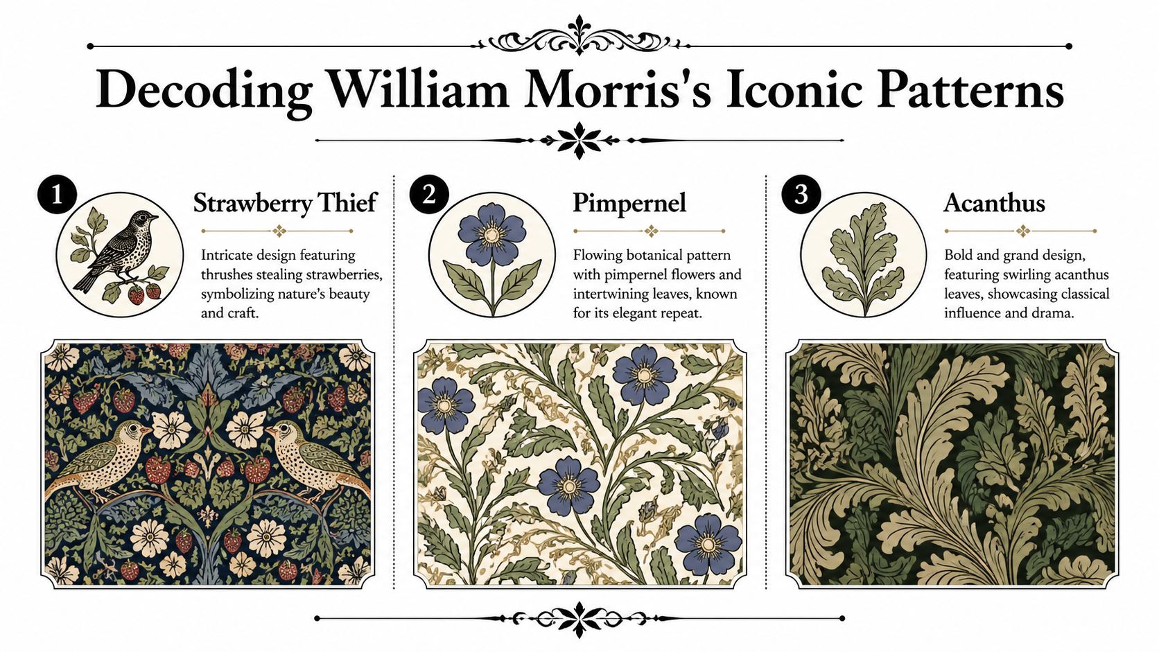
Strawberry Thief is often a person's first real encounter with Morris, and it makes an immediate impression because it contains a small drama. Thrushes slip among fruit and foliage with the alertness of creatures caught in the act. The pattern feels ornamental, but it also feels inhabited.
Its power comes from contrast within the design itself. The birds are crisp and readable. The surrounding leaves and stems are richer, denser, and more entwined. As a result, the eye alternates between spotting the bird and losing it again in the garden. That small cycle of discovery gives the wallpaper its energy.
For a collector or decorator, Strawberry Thief offers a practical lesson. Use it where you want the wall to carry personality, such as a dining room, powder room, or a study that benefits from intimacy and visual wit. In a large open-plan room, it can become a focal field rather than a background surface.
Willow Boughs speaks in a lower register. Long leaves arc and repeat with the steadiness of water or wind passing through branches. Many people assume a quieter pattern is easier to design. Morris proves the opposite. A restrained motif leaves nowhere to hide. Every curve has to be beautifully judged, or the repeat turns mechanical.
That discipline is what makes Willow Boughs so useful today. It gives a room softness without vagueness and pattern without clutter. If someone loves Morris in principle but fears visual heaviness, this is often the pattern that changes their mind.
It works especially well in bedrooms, stair landings, and living rooms where the goal is calm enclosure rather than spectacle.
With Pimpernel, Morris moves toward richness at full stretch. Flowers turn through scrolling leaves in a pattern that feels almost woven rather than printed. The wall starts to behave less like a flat boundary and more like a textile hanging in the room.
The point many first-time buyers miss is scale. On a sample sheet, Pimpernel can read as charming detail. Installed across four walls, its repeat creates structure. The larger leaf forms act like hidden armature, holding the whole design together much as branches hold a climbing plant. That makes it a strong choice for rooms that need visual architecture, especially plain spaces with simple trim or newer construction that lacks historic moulding.
Look closely and you will see why the pattern remains orderly:
Acanthus shows Morris in a more public, ceremonial mood. The leaf itself carries a long history in classical ornament, yet Morris gives it pressure and lift, as if the foliage were still growing rather than copied from stone carving. The result is grand, but not static.
This pattern asks more from a room. High ceilings, generous chimney breasts, strong timber, and deep colour all help it breathe. In the right setting, it gives architecture a sense of occasion. In a tighter room, a single feature wall or alcove can be the wiser choice.
That question of mood matters. Morris was not designing interchangeable surfaces. He was shaping atmosphere. If you compare Acanthus with the freer, lighter informality discussed in Dalaart's piece on the Josef Frank poster, the difference becomes clearer. Both designers loved nature, but they translated it into rooms with very different emotional temperatures.
At the far end of Morris's ambition sits St. James's, designed in 1880 for St. James's Palace in London. The V&A's account of William Morris and wallpaper design notes that it required 68 separate woodblocks and had a vertical repeat of 127 cm. Those figures matter because they show how far Morris pushed wallpaper beyond ordinary domestic pattern-making.
Seen in that light, St. James's is a statement about craft as much as ornament. The dense scrolling forms and layered colouring create a depth that Victorian machine printing struggled to match. For today's buyer, it also offers a useful benchmark. When a Morris paper feels unusually rich, spacious in repeat, and almost architectural in effect, it is often drawing from this higher level of compositional ambition.
Across these designs, a family resemblance appears. Morris studies plants closely, but he does not copy them like a botanist pressing specimens. He edits nature into pattern. Stems become pathways for the eye. Leaves become structure. Small motifs, whether birds, blossoms, or tendrils, keep the surface lively without breaking its order.
A quick way to identify that signature is to ask four questions:
Those questions matter for more than connoisseurship. They help you choose well. Once you understand how Morris builds rhythm, scale, and atmosphere, you can match the right pattern to the right room, and his wallpapers stop being museum favorites alone. They become practical tools for shaping how a home feels day to day.
Collectors often feel a little nervous around Morris wallpaper because it sits in three worlds at once. There are rare Victorian survivals. There are licensed modern reproductions. Then there are “Morris-style” designs that borrow the look without much of the discipline. Learning to separate those categories is less mystical than it sounds.

The first clue is physical. An original paper often shows age in ways a reproduction doesn't. That can mean gentle toning, edge wear, old paste marks, or irregular fading. None of those signs prove authenticity by themselves, but they do tell you that the paper has lived a life.
A modern licensed reproduction usually feels cleaner and more consistent. That's not a criticism. For many decorators, that's exactly what they want. The point is to understand that condition and age are different questions. A well-preserved older fragment may still look lively. A new paper may deliberately reproduce an old pattern while using newer materials and inks.
Block printing tends to create a surface with presence. You may see slight variation in ink laydown, subtle relief, or tiny differences where hand processes leave their mark. Digital or mass-market printing often looks flatter and more uniform.
When you're examining a sample, ask yourself:
These aren't rules that solve everything, but they sharpen your eye.
Collector's check: If a seller claims a paper is old, ask for close photographs of the surface, edges, reverse, and any selvedge markings. General room shots won't tell you enough.
Provenance sounds grand, but in practice it means asking ordinary questions carefully. Where did the piece come from. Was it removed from a house. Has it been backed, trimmed, restored, or reframed. Is it a full roll, a partial roll, or a fragment.
If the seller can't answer those questions, that doesn't automatically make the paper wrong. It does mean you should buy it for decorative value rather than for certainty. Confidence rises when the story becomes more specific.
A sensible authentication checklist includes:
A licensed modern reproduction isn't a second-rate substitute. It serves a different purpose. It gives you access to Morris's design language in a form suitable for present-day interiors. If you want to install a whole room, a proper reproduction is almost always the more practical route.
The video below is useful because seeing wallpaper handled in motion helps you notice details that still images can hide.
Walk away when the description is vague, the photographs are poor, and the claim is grander than the evidence. “Victorian style” is not the same as Victorian. “After Morris” is not the same as Morris & Co. “Old” is not the same as original.
The best buyers aren't the quickest. They're the ones who can hold admiration and caution at the same time.
The first surprise for many homeowners is how different a Morris paper feels once it leaves the sample book and enters a room. In the hand, it is a pattern. On the wall, it becomes an atmosphere. A hallway can feel sheltering. A dining room can gain a kind of hush. Even a small cloakroom can take on the richness of a lacquered box lined with leaves and fruit.

That shift helps explain why Morris still works in contemporary homes. He designed against lifeless decoration. His wallpapers were meant to bring pattern, structure, and the energy of the natural world into daily life. The modern decorator's task is the same one a good curator faces in a gallery. Give the work enough space, enough context, and enough respect for its rhythm.
Morris wallpaper rewards restraint around it. The pattern already supplies movement, detail, and visual music, so the rest of the room can keep a steadier beat. Clean-lined sofas, plain painted woodwork, linen curtains, oak tables, leather chairs, and lamps with simple silhouettes let the wall speak clearly.
Room use matters as much as furniture style.
Collectors and decorators often worry that using Morris means turning a room into a heritage display. It does not. The stronger approach is to borrow his principles rather than stage a re-creation. Use natural materials. Repeat colours from the wallpaper in upholstery or paint. Let ornament live beside simplicity. Readers interested in other ways pattern creates mood may also enjoy this guide to a Christmas wallpaper aesthetic, which explores seasonal richness and decorative atmosphere from a different angle.
Scale changes everything. A large, sweeping repeat can read more calmly than a smaller, busier one because the eye can settle into broader forms. A tiny sample rarely shows that effect well. Morris patterns need room before their logic becomes visible.
Colour asks for the same patience. Deep greens, inky blues, madder reds, ochres, and softened neutrals often suit these designs because they support the sense of foliage layered over foliage, stem crossing stem. In a present-day interior, one reliable method is to lift a quieter note from the paper and echo it elsewhere. A muted green from a leaf can reappear on cabinetry. A red from a flower head can return in a rug border or cushion piping. That repetition ties old design language to modern furnishing without making the room feel costumed.
If a sample seems overwhelming, reduce the noise around it before dismissing it. Morris wallpaper often looks crowded only when it is competing with too many unrelated objects, finishes, and colours.
Installation is where admiration meets craft. A Morris pattern depends on continuity, so small technical errors become very visible. As noted in the Morris & Co wallpaper guide, rolls are commonly made to standard dimensions, pattern repeats vary widely, and extra paper should be ordered to allow for matching. That allowance is not wasteful. It is part of respecting the design.
A wall with bumps, cracks, or uneven colour will show through more readily under a detailed repeat than under a plain paper. Morris did not design camouflage for bad plaster. He designed ordered abundance, and order needs a sound surface.
A good hanging process works like setting a textile pattern on a loom. The first alignment determines what follows, and every later adjustment is harder if the beginning is careless.
Professional installation is often worth the cost in a prominent room, especially with a treasured licensed reproduction or a paper with a pronounced repeat. The result is not only neater. The pattern reads as Morris intended, with leaves, fruit, birds, and stems flowing across the wall in one continuous field.
The common mistakes are predictable. Too little paper gets ordered. Wall preparation is rushed. Seams are forced instead of aligned. Furniture and fabrics compete with the wallpaper rather than supporting it.
Handled well, Morris wallpaper does something rare. It gives a room ornament and structure at the same time. That is why it still feels relevant. For a collector, it offers a way to live with design history. For a decorator, it offers a practical lesson in balance: richness on the wall, clarity everywhere else.
Buying Morris wallpaper is rarely just a shopping task. It is usually a choice about how you want to live with design history. Some buyers want a room wrapped in a faithful modern production. Others want a fragment with age, patina, and the intimacy of survival. Both approaches are valid, but they answer different desires.
New production makes sense when your priority is installation, continuity, and reliability. You can order enough rolls for a room, expect consistency across the batch, and work with a paper intended for active domestic use. This route suits decorators who want the Morris experience on the wall, not in a drawer or archive box.
Vintage or salvaged paper appeals for different reasons. A fragment can carry remarkable presence. It may have softened colours, old fold lines, or traces of the room it once inhabited. Framed well, it behaves almost like a print. The trade-off is uncertainty. You may not find enough to complete a room, and condition becomes part of the object's identity.
A third category deserves caution. These are contemporary papers that borrow Morris's language but not necessarily his exact designs or standards. They can be attractive in their own right, but don't pay heritage prices for a paper that is merely heritage-flavoured.
A good purchase often depends on the quality of the conversation before payment. Ask direct questions and listen to the precision of the answers.
Some questions are practical:
Other questions are interpretive. Ask where the item came from and whether the seller believes it is original, licensed reproduction, or later adaptation. Their willingness to distinguish those categories often tells you how careful they are.
Buy from descriptions, not from romance. A poetic listing can still hide a badly damaged piece.
The smartest buyers decide the use before they decide the source. If you want to paper a bedroom, reliability outranks rarity. If you want one evocative object for a study wall, a salvaged fragment may be more moving than a brand-new roll.
Consider these use cases:
If your taste already spans decorative traditions, it can help to compare how you buy across categories. Dalaart's article on graffiti wall paper shows a very different visual culture, but it raises the same useful question. Are you buying surface effect, cultural meaning, or both?
Confidence doesn't mean certainty about every detail. It means the evidence matches the claim closely enough for the purpose of your purchase. For a newly made paper, that might mean clear product information and consistent stock. For an old fragment, it might mean honest wear, credible identification, and enough documentation for you to feel comfortable.
Collectors sometimes think they must choose between scholarship and pleasure. In practice, the two strengthen each other. The more carefully you buy, the more fully you can enjoy what you've bought.
Once Morris wallpaper is on the wall, or once a historic fragment enters your collection, care becomes part of appreciation. These papers are decorative objects, but they are also vulnerable surfaces made of paper, pigment, and paste. Preservation starts with small habits.
Direct sunlight is one of the most persistent threats to any wallpaper. Even a beautiful room can age a paper unevenly if one wall receives strong day after day exposure. If a Morris paper sits in a bright room, use curtains, blinds, or careful furniture placement to reduce the harshest light.
Dust matters too. Letting grime build up makes later cleaning riskier. The safer approach is gentle, regular attention. Use a soft dry cloth or similarly gentle dusting method rather than vigorous rubbing. The aim is to lift surface dust, not scrub the finish.
Homeowners can safely deal with minor issues if they move slowly. A slightly lifting seam, for example, calls for restraint. Reattach it neatly with an appropriate adhesive and light pressure rather than flooding the area. If paste squeezes out, clean it carefully and sparingly.
Scuffs are trickier. Don't assume every mark should be attacked. Sometimes the attempt to clean causes more visible damage than the blemish itself. Test any method in the least conspicuous area possible, and stop if the surface begins to change.
A good household conservation routine looks like this:
Treat the wallpaper as you would a work on paper in a frame. Gentle handling preserves more than energetic cleaning ever will.
Some problems need a conservator or an experienced paperhanger rather than a confident amateur. That includes broad areas of detachment, staining linked to damp, brittle historic fragments, or any damage affecting a rare original. Professional help is also wise when a framed fragment needs mounting or backing that won't create future stress.
The guiding principle is simple. Routine stewardship should be light, preventive, and reversible where possible. Once a repair becomes structural, specialist skill matters.
Morris wanted homes to be filled with objects made and used with care. Preserving his wallpaper in that same spirit is one of the best ways to honour the work.
If you love decorative traditions shaped by the human hand, Dalaart is worth exploring. Its collection of authentic Swedish Dala horses and companion animals brings the same respect for craft, heritage, and lived beauty into the home, with pieces that feel collected rather than merely purchased.


.svg)


.png)


