April 29, 2026
You might be standing in your living room with two competing instincts. One wants calm. Less visual noise. More breathing room. The other wants personality. Family pieces, meaningful objects, the colour and memory held in traditional Scandinavian craft. Many homes get pulled too far in one direction. They become either sparse and impersonal, or full of lovely things that never quite settle into harmony.
That tension is exactly why minimalist poster art matters.
A well-chosen poster can quiet a room without flattening it. It can give the eye a place to rest, help older pieces feel intentional, and create a bridge between modern interiors and heritage objects. This is especially useful if you love Scandinavian folk art. A carved Dala horse, a painted rooster, a vintage textile, or a hand-finished wooden figure already carries strong character. Instead of competing with those pieces, minimalist art can frame them, echo them, and let them shine.
I see this often in homes that feel most memorable. There’s usually a balance between restraint and warmth. A pared-back print on the wall. Natural wood nearby. A folk object on a shelf that suddenly looks even more sculptural because the surrounding space isn’t fighting for attention. The room feels calm, but not anonymous.
Minimalism, in that sense, isn’t about removing soul. It’s about editing with care.
A serene room rarely happens by accident. More often, someone has carefully decided what deserves attention and what doesn’t. They’ve left space around a favourite chair. They’ve chosen one artwork instead of five. They’ve let a small handmade object hold meaning instead of burying it among distractions.
That’s the emotional power of minimalist poster art. It creates clarity. Not emptiness. Not coldness. Clarity.
In practical terms, a minimalist poster might feature a single shape, a short phrase, a restrained palette, or a simple line drawing. But its primary effect is felt before it is analysed. You walk in and your shoulders drop a little. The wall feels organised. The room looks considered. The objects you love feel more valuable because they aren’t competing for air.
This matters in Scandinavian-inspired interiors because those spaces often rely on a delicate balance. Pale woods, natural light, tactile fabrics, and folk art all work best when the room has rhythm. A bold traditional piece, like a painted Dala horse, doesn’t need a busy gallery wall behind it. It needs contrast of another kind. Simplicity beside detail. Quiet around colour.
Minimalism works beautifully in homes with heritage because it gives tradition a stage instead of a rival.
If you’ve ever worried that modern minimalism might erase the warmth of old craft, the opposite is often true. Clean-lined poster art can make a hand-carved object look even more human. A restrained black frame can make folk painting feel more vivid. White space can give memory more room.
That’s where minimalist poster art becomes more than a trend. It becomes a decorating language for people who want a home to feel settled, personal, and beautifully edited.
Minimalist poster art is easiest to understand when you think like a chef. A great simple dish uses fewer ingredients, but each one has to work harder. The same is true on the wall. If a poster includes only a shape, a line of type, and a small colour contrast, every choice must be intentional.
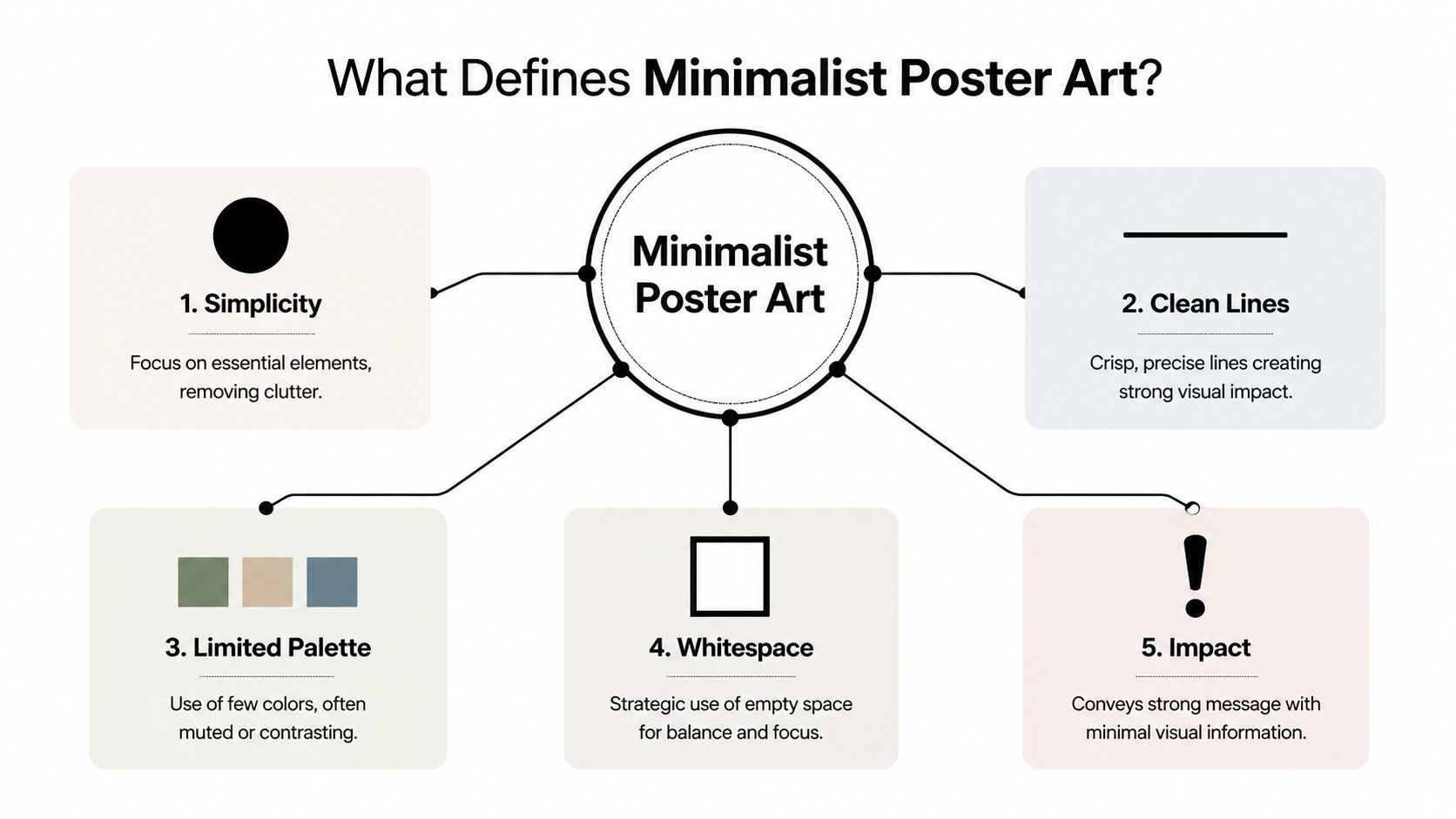
The first defining trait is reduction. The artist removes anything that doesn’t support the main idea. That might mean replacing a detailed illustration with a circle, a silhouette, or a single contour line. It can also mean using one word instead of a paragraph.
Some people become confused. They assume minimal means unfinished. It doesn’t. It means edited. The work has been refined until only the essential visual message remains.
The empty area around the main element is often called negative space. In minimalist poster art, that space isn’t wasted. It directs your attention.
When a poster gives one form room to breathe, the eye knows where to go first. That’s why minimalist designs often feel calm but still striking. The poster isn’t shouting with detail. It’s guiding with restraint.
Shapes carry a surprising amount of emotional weight. A circle feels soft and complete. A square feels grounded. A tall vertical line can feel architectural or contemplative. In minimalist posters, these formal qualities become central because there’s little else to distract from them.
You can see how this translates into interiors. A geometric print above a wooden console can make the whole area feel more structured. A single-line drawing in a bedroom can soften the mood without adding clutter.
Sometimes the poster’s main visual element is type itself. A sans-serif word in large scale can function like an abstract form. Spacing, alignment, and letter weight all become design tools.
That’s one reason minimalist typography pairs so well with folk objects. The poster brings order and modernity. The craft piece brings texture and story.
Modern poster minimalism didn’t appear out of nowhere. The wider Minimalist movement was shaped by key moments in twentieth-century art. The Art Story’s account of Minimalism notes that the “Primary Structures” exhibition in 1966 at the Jewish Museum in New York was a significant milestone, featuring over 40 artists including Sol LeWitt and Donald Judd. The same source identifies Frank Stella’s “Black Paintings” from 1958 to 1960 as foundational, tied to the idea “What you see is what you see.”
That phrase still explains a great deal about minimalist poster art. It asks the viewer to pay attention to surface, shape, balance, edge, and proportion, instead of searching for decorative excess or hidden drama.
Practical rule: If every element in a poster can answer the question “why am I here?”, the design is probably moving in a minimalist direction.
Minimalist poster art isn’t bare for the sake of being bare. It’s art that trusts composition, form, and restraint.
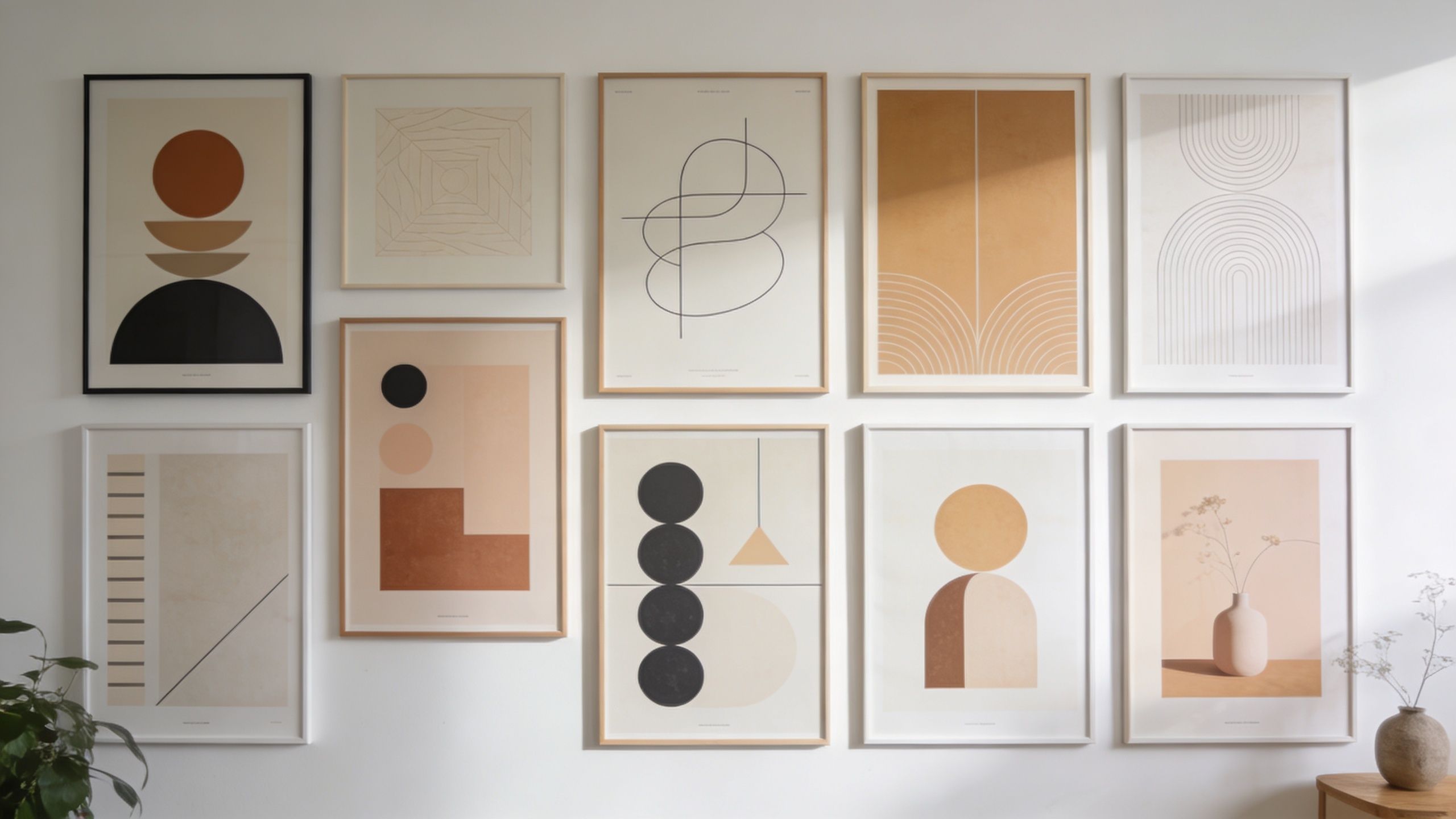
Minimalist poster art isn’t one look. It’s a family of approaches. Some posters feel architectural. Others feel lyrical. Some rely on geometry, while others use a hand-drawn line that feels almost intimate.
Consider how these common styles change a space:
If you enjoy colour-field art and want to understand how emotion can live inside simplicity, a Mark Rothko poster perspective offers a useful point of comparison, even though Rothko’s work sits in a different conversation from poster design.
Colour does much of the heavy lifting in minimalist design. A restrained palette helps the eye settle. It also helps separate the essential from the decorative.
According to this discussion of minimalism in poster design, a limited colour palette is key, and palettes in 85% of contemporary Nordic posters improved viewer retention by 40% in A/B tests. The same source connects that effect to reduced cognitive load and to “lagom”, the Scandinavian idea of balanced restraint. It also notes that a single vibrant contrasting element can anchor the composition and trigger curiosity.
That helps explain why one rust-red shape on a field of cream can feel more memorable than a poster packed with colour.
Here’s a simple way to think about palette choices:
The strongest minimalist posters often use colour the way a jeweller uses a single stone. Sparingly, and exactly where it matters.
For Scandinavian homes, that principle is especially useful. A limited palette doesn’t mute personality. It organises it.
A beautiful poster can lose its effect if it’s framed poorly or hung without enough thought. Display is part of the artwork’s language. Frame width, wall placement, spacing, and surrounding objects all affect how the piece is read.

Minimalist posters usually work best in frames that don’t compete with the image. Thin oak brings warmth. Black frames sharpen contrast. White frames can feel light and gallery-like, especially on pale walls.
Matting also matters. A generous mat gives the work visual breathing room and can make even a small print feel composed and intentional. This is particularly effective when the poster itself is simple. The mat extends the experience of negative space beyond the printed image.
If the room already includes folk art with painted detail or carved texture, choose frames that act as a quiet counterpart. You want the frame to hold the poster steady, not steal attention from either the print or the handcrafted object nearby.
Many people hang art too high or place frames too close together. Both mistakes create tension.
Guidance on minimalist poster display notes that posters are often hung on a grid with 4 to 6 inches of spacing between frames, and that placing the centre of the art at 57 to 60 inches from the floor aligns with average eye level in galleries. The same source says strategic use of negative space can increase design clarity and viewer engagement by up to 35%.
That information is practical, not precious. It means your wall will usually look calmer if you:
A single oversized minimalist poster creates calm quickly. It works well above a bed, a sofa, or an entry console. The wall feels decisive, and the poster gets full attention.
A gallery wall can also work, but only if the arrangement stays disciplined. Keep the palette controlled. Repeat frame materials. Let one piece lead while the others support.
This visual guide helps if you want to see those placement ideas in action.
Hanging note: If a display feels busy, the answer usually isn’t buying different art. It’s removing one piece, widening the spacing, or lowering the arrangement to a more natural viewing height.
Good framing and hanging make minimalist poster art feel intentional. They also make the rest of the room look more organised.
Minimalist poster art takes on a particular fascination when viewed alongside Scandinavian folk art and modern minimalism, which initially appear as opposites. One is often colourful, painted, symbolic, and handmade. The other appears pared back and restrained. In a well-styled room, though, they speak to each other beautifully.

Both traditions value clarity of form. A Dala horse is already a simplified silhouette. Its power comes from recognisable shape, rhythm, and handcrafted finish. Minimalist poster art values those same foundations, even when the final result looks more contemporary.
That overlap is often ignored in mainstream decorating advice. This overview of minimalist poster search trends points out that integrating Swedish folk motifs such as Dala horses into minimalist poster design is an underserved topic, even though interest in “Dala horse decor” in Sweden rose by 25% over the past year. The missed opportunity is obvious. Clean lines and cultural icons don’t clash. They sharpen each other.
A few combinations work particularly well:
Typographic print plus painted Dala horse
Hang a black-and-white poster with strong sans-serif lettering above a shelf. Place a traditional red or blue Dala horse below it. The poster brings structure. The horse brings pattern and warmth.
Geometric poster plus carved animal form
Choose a print with circles, blocks, or arcs in muted tones. Nearby, display a carved rooster, moose, or horse. The geometric shapes echo the solidity of the carved object without copying it.
Soft abstract poster plus vintage folk textiles
If your room includes woven runners, embroidered cloth, or floral folk motifs, use a minimalist poster with broad organic forms in oat, charcoal, or dusty clay. The poster calms the wall so the textile details can stay legible.
The aim isn’t to make every object announce “Scandinavia.” A more convincing room mixes references lightly. Let one or two heritage objects carry the story, then use minimalist art to frame the atmosphere around them.
A useful approach is to repeat one quality rather than one symbol. Repeat colour, or shape, or material. For example, if a horse has a curved silhouette and red painted accents, choose a poster that echoes the curve or the red, not both.
If you enjoy seeing how handmade pieces come together before they reach a room, the behind-the-scenes view of Dala craft is helpful for understanding the material logic behind these objects.
Try this arrangement in a sitting room or hallway:
That composition works because each element has a role. The poster creates stillness. The horse introduces memory and colour. The wood keeps everything grounded.
Folk art doesn’t need a rustic setting to feel authentic. It often looks even more alive when placed against clean, modern lines.
This pairing gives a home something many interiors lack. Restraint with character.
Making your own minimalist poster can be surprisingly approachable. You don’t need to be a trained graphic designer. You need a clear subject, a willingness to simplify, and some patience with editing.
That’s one reason DIY interest has grown. This discussion of minimalist decor demand reports a 40% surge in “DIY minimalist art” queries on Pinterest in Sweden, alongside a content gap around sustainable materials. The same source says 60% of Scandinavian interior stylists are seeking “heritage-minimalist” hybrids for 2026, which is framed there as a projection of where styling interest is heading.
A good beginner subject is a recognisable form, such as a horse, bird, leaf, cup, or chair. If you love folk art, a Dala horse is ideal because the silhouette is already strong.
Try this process:
For readers who like line-based approaches, this one-line art drawing guide is a useful companion when experimenting with simplified forms.
Minimalist poster art pairs naturally with lower-impact material choices because the aesthetic doesn’t depend on glossy excess.
Look for:
If you’re buying a ready-made folk object to style with your print, Dalaart offers hand-carved Swedish Dala animals made with recycled wood and environmentally safe paints, which makes them a factual example of a heritage object that can sit naturally beside a minimalist poster.
Homemade or purchased, a poster lasts longer when it’s treated like a real object, not disposable décor.
Keep it away from direct sunlight where possible. Avoid hanging it in damp spots without proper protection. If you use a frame, clean the glazing gently and make sure the print isn’t pressed against moisture-prone backing.
A simple care routine helps preserve both colour and paper quality:
The beauty of making your own work is that you begin to see minimalist poster art differently. You notice what can be removed, what must stay, and why restraint can feel so expressive.
Minimalist poster art asks for fewer choices on the wall, but better ones. That’s why it works so well in real homes. It doesn’t demand that you abandon warmth, memory, or tradition. It helps you organise them.
When paired with Scandinavian folk pieces, the effect can be especially moving. A clean poster gives a carved Dala horse more presence. A quiet palette lets painted detail glow. Negative space around handmade objects creates dignity, almost like a small gallery moment inside daily life.
That’s the deeper appeal of this style. It isn’t about copying a trend. It’s about noticing what deserves focus in your home and giving it room.
If your walls feel unsettled, start small. One poster. One shelf. One handcrafted object nearby. Adjust the spacing. Simplify the frame. Let the room breathe a little more than it did before.
Homes don’t become personal because every surface is filled. They become personal because the right things are given meaning.
If you’d like to bring that balance of modern simplicity and Swedish heritage into your own space, explore Dalaart for authentic hand-carved Dala horses and companion animals that pair beautifully with minimalist poster art.


.svg)


.png)


