January 26, 2026
A pop art poster is a real statement piece. It grabs your attention with bold colours and familiar, everyday imagery, turning things from mass culture—like soup cans or comic strips—into high art. This makes it an incredibly vibrant and energetic choice for any room in your house.
Think about taking a snapshot of the most lively parts of pop culture and turning it into art. That’s really the heart of a pop art poster. This style burst onto the scene in the 1950s and 60s, serving as a direct challenge to the more serious, traditional art forms of the day. Instead of painting landscapes or abstract shapes, artists turned their focus to the world right in front of them: advertising, celebrity faces, and commercial products.
The whole point was to tear down the walls between "high" art and "low" culture. A pop art poster doesn't make you ponder complex theories; it shows you something you already recognise, but in a totally new way. This approach made art fun, relatable, and available to everyone, not just the usual gallery crowd. It’s art that confidently steps out of the museum and into your living room.
To really get what gives a pop art poster its magnetic pull, you have to know its core visual ingredients. These are the characteristics that work together to create a look that's simply impossible to ignore—the building blocks of its rebellious and playful spirit.
Here are a few key visual traits:
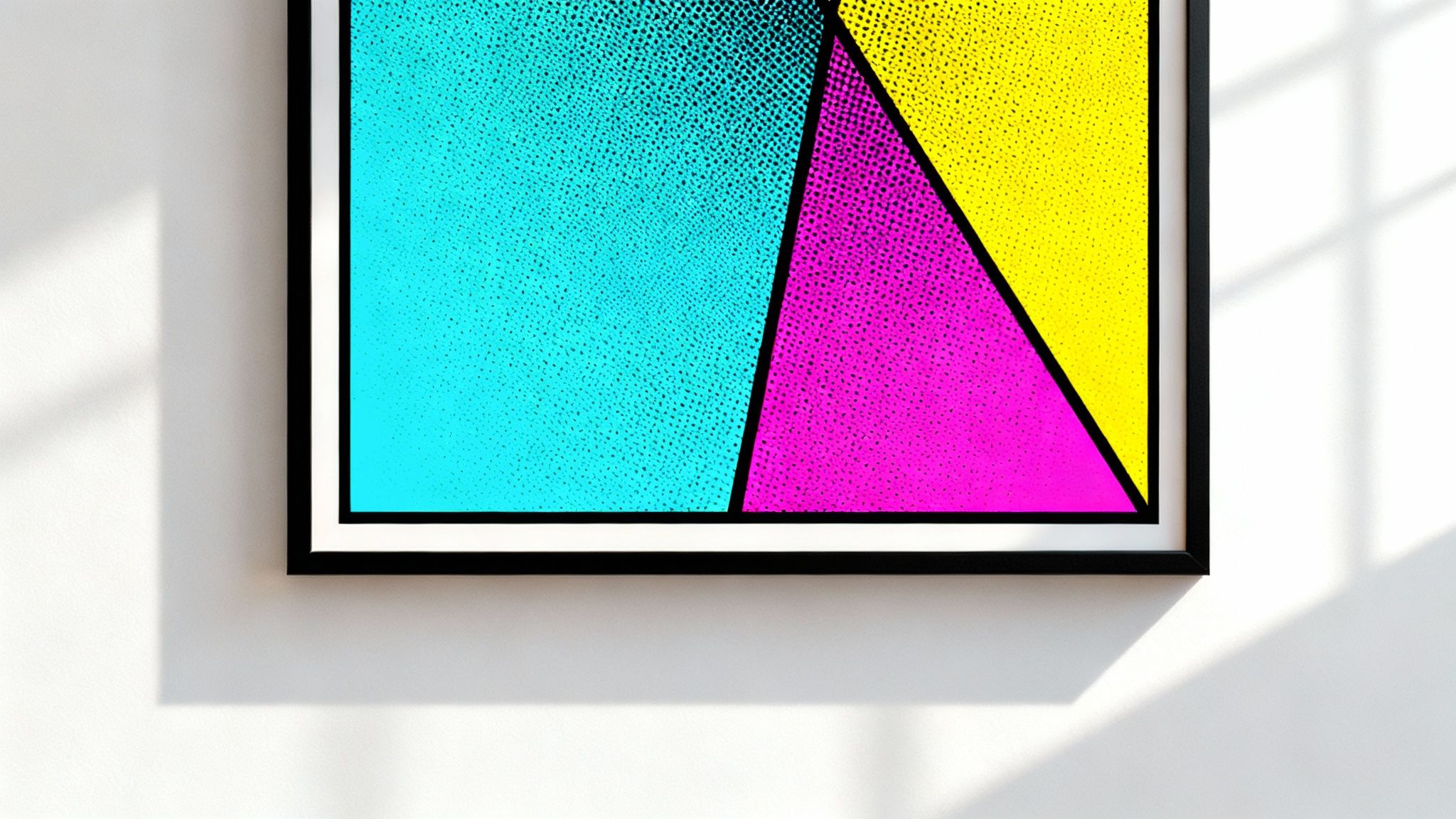
One of the most distinctive features you'll see is the use of Ben-Day dots. This is a printing technique borrowed from comic books, where small coloured dots are used to create shading and even secondary colours. When you look closely, you see a pattern of dots; step back, and they blend together to form a solid colour or a smooth gradient.
This mechanical, almost machine-made feel was completely intentional. It removed the artist's personal brushstroke, tying the art even closer to the world of commercial printing and mass-produced goods.
Once you understand these elements, you can see how a pop art poster is put together. It’s a deliberate mix of commercial techniques and artistic vision, creating something that feels both familiar and refreshingly new. It's this unique combination that has kept the style a powerful and timeless choice for personalising any space.
To really get the most out of your pop art poster, it helps to know the incredible story it tells. Let's travel back to the buzzing 1950s and 60s, a time of massive consumer growth and cultural shifts. Back then, the art world was largely in the grip of Abstract Expressionism—deep, serious paintings that felt a world away from the average person's life.
A new wave of artists started to notice this disconnect. They looked at the world exploding with energy around them—bright advertisements, Hollywood stars, comic strips, and supermarket aisles crammed with products—and they saw art. This was the real world, the one people were actually living in, and they were convinced it deserved to be on a canvas.
Pop art burst onto the scene as a fun, direct rebellion. Its goal was simple: to tear down the velvet rope that separated "high art" from everyday popular culture. Out went the complex, abstract paintings, and in came art that was immediate, recognisable, and frankly, a lot of fun. It was a completely radical idea at the time.
At its heart, pop art was all about accessibility. It wasn't made for a select few in quiet, sterile galleries. It was for everyone, reflecting a shared cultural experience that was loud, colourful, and completely unapologetic about its commercial roots.
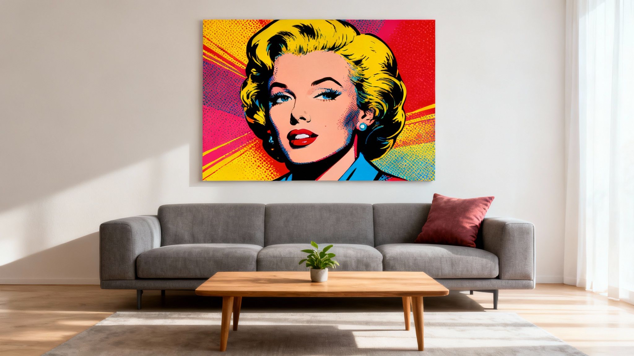
This new approach changed everything. By placing a humble soup can or a comic book hero in a frame, artists like Andy Warhol and Roy Lichtenstein turned the mundane into something monumental. They forced people to see their own daily lives in a new way, celebrating the very things traditional art had always looked down upon. This democratisation of art is a huge part of why the pop art poster is still so loved today.
The journey of pop art from a controversial, avant-garde style to a staple of home decor really shows its lasting power. At first, the art establishment was shocked. Pop artists embraced commercial methods like screen printing, which copied the look of mass production and intentionally scrubbed away the artist's "personal touch" to make a point about the machine-made world we were living in.
But over time, those very features became its greatest assets. The bold colours, clean graphic lines, and familiar subjects have a timeless appeal that continues to bring energy and life to any room. If you're drawn to this era, it's worth exploring the artists who shaped it. You can learn more about key figures like Keith Haring in our guide, which takes a closer look at his unique contribution to the movement.
What began as a clever commentary on mass culture has now become a beloved part of it. It’s proof that great art can be both incredibly profound and incredibly popular. A pop art poster on your wall isn't just a pretty picture; it’s a small piece of that rebellious, vibrant history.
Bringing a pop art poster into your home is like dropping a little explosion of creative energy into the space. The real trick is knowing how to direct that energy, making sure the piece lifts the room up instead of taking it over. So let's move past the theory and get into the practical side of making this iconic style feel right at home, whatever the room.
This whole idea of using wall art to put a personal stamp on our homes is catching on everywhere. Just look at the Asia-Pacific wall art market—it's expected to grow at a rate of 5.9% a year between 2023 and 2030, all because people want decor that feels uniquely theirs. With e-commerce, it's never been easier to pick the perfect size, frame, and style, turning wall art into a must-have design element. You can read more about the growth of the wall art market and see just how big this trend is.
A pop art poster’s personality can really change depending on where you put it. A piece that brings a buzz to your home office might just feel like a bit too much for the bedroom. It’s all about matching the vibe of the art to the purpose of the room.
Here are a few ideas to get you started:
Once you know which room it's for, the next step is making it all look harmonious. This really boils down to two things: colour and scale. You need to decide if you want your poster to be the undeniable star of the show or a brilliant supporting player.
To make your poster the main event, hang it against a neutral wall—think white, grey, or a soft beige. This gives its saturated colours room to breathe and demand attention without fighting with anything else.
If you'd rather weave it into your existing decor, try picking out one or two of the less dominant colours from the poster and echoing them around the room. For example, if there's a flash of electric blue in the print, a couple of blue cushions on the sofa or a blue vase on a shelf is all it takes. This simple trick ties everything together for a polished, professionally styled feel.
When it comes to scale, it's all about proportion. A tiny print will look completely lost on a huge, empty wall, while a massive piece can make a small room feel cramped and cluttered. A good rule of thumb is that any art hung above a sofa should be about two-thirds the width of the furniture itself. This creates a natural balance and makes the piece look like it was always meant to be there.
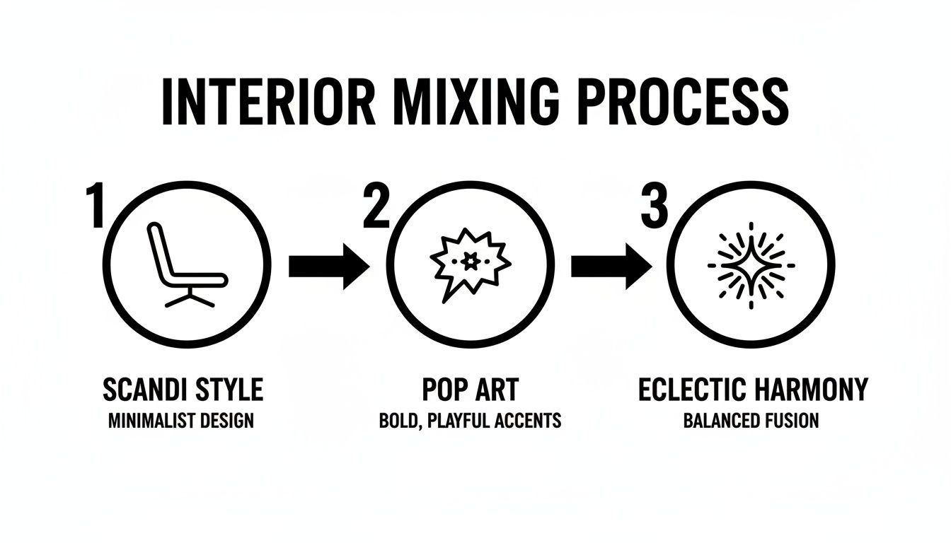
At first glance, pairing a bold, explosive pop art poster with the quiet, functional elegance of Scandinavian design might sound like a recipe for a style clash. One shouts with vibrant colour and raw energy; the other whispers with natural textures and calm neutrality. But it's this very contrast that can create a truly captivating and personal space.
Think of Scandinavian design as the perfect, understated canvas. Its focus on clean lines, natural materials like light wood, and a muted colour palette creates a serene backdrop. When you introduce a single, powerful pop art piece into this setting, it acts as a deliberate and exciting interruption. It’s like adding a shot of espresso to a calm morning—an energising jolt that awakens the entire room.
This unexpected pairing is the perfect antidote to a minimalist space that risks feeling too sterile or cold. The pop art poster becomes an instant focal point, injecting personality and a playful spirit without disrupting the overall sense of order and calm.
The key to successfully blending these two styles is intentionality. You aren't just throwing things together; you're creating a thoughtful dialogue between modern energy and timeless simplicity. This approach allows you to build a room that feels both curated and uniquely yours, reflecting different facets of your taste.
Here’s how to make it work:
This idea of mixing styles extends beautifully to folk art, particularly cherished items like the Swedish Dala horse. These hand-carved, brightly painted figures represent heritage, craftsmanship, and a rich cultural story. Placing a modern pop art poster alongside such a traditional piece creates a fascinating visual narrative right in your home.
Imagine a classic, red Dala horse sitting on a mantelpiece. Above it hangs a pop art poster that features a bold splash of the very same red. This shared colour creates an immediate and powerful connection between the two objects, bridging generations of art and design. The folk art grounds the space in tradition, while the poster brings a contemporary edge. To learn more about mixing modern and traditional Swedish aesthetics, you might find inspiration in our article on the iconic designs of Josef Frank.
This combination tells a personal story. It suggests a respect for heritage alongside an appreciation for modern creativity, creating a layered and deeply authentic interior.
Ultimately, mixing a pop art poster with Scandinavian or folk styles is all about celebrating contrast. It’s a design strategy that proves that opposites don't just attract; they can create something far more interesting and dynamic than either style could ever achieve on its own.
Choosing the right frame is that final, critical touch that elevates your pop art poster from a simple print into a real piece of art. The perfect frame doesn’t just protect your investment; it enhances its visual punch, making sure it fits right into your home. It’s the difference between taping a poster to the wall and making a genuine design statement.
Picking the right frame is about more than just finding something you like—it’s about creating balance. You have to think about the poster's size, the colours splashing across the artwork, and the style you've already got going in the room. A well-chosen frame should feel like a natural extension of the art, drawing your eye in without stealing the show.
The style of your frame can completely change the mood of your pop art poster. You’ll find that sleek, simple frames are often the best bet, as they let the artwork’s bold colours and graphic lines take centre stage.
Here are a few popular options that work beautifully:
That paper-like border between the poster and the frame? That’s a mat board, and it’s a small detail that makes a world of difference. It creates visual breathing room around the art, so it never looks cramped inside the frame. This simple separation gives the whole piece a much more professional, gallery-quality finish.
A mat board does more than just make the poster look good—it also provides crucial protection. By lifting the frame's glass off the surface of the print, it prevents any potential damage from moisture or condensation over time.
For most pop art posters, a simple off-white or bright white mat is the safest and most effective choice. It acts as a neutral buffer that helps the colours appear even more vibrant and saturated. Try to aim for a mat that’s about 5-8 cm wide for a balanced, classic look that just feels right.
Bringing a pop art poster into your home is more than just a purchase; it's a journey of discovery. It’s about finding a piece you connect with, one that you'll love looking at for years to come. That means thinking beyond just the image itself and considering where it came from, its quality, and even its environmental footprint. A conscious choice always adds another layer of meaning to your art.
There's a huge appetite for accessible, gallery-quality art that lets us personalise our homes and offices. In fact, the global market for posters and artwork is booming, expected to more than double from $5.0 billion in 2020 to a projected $10.5 billion by 2033. You can explore more on the expanding posters and artwork market to see how this trend is shaping what's available to art lovers.
As you start your search, think about what makes a print truly special. For collectors, authenticity is everything. This is where limited-edition prints come in—they're often signed and numbered by the artist, ensuring you're getting a piece of genuine craftsmanship, not just a mass-produced item.
At the same time, sustainability has become a big consideration for many of us. It feels good to support artists and printers who use eco-friendly materials.
This mindful approach applies to vintage pieces, too. Diving into the world of older prints can lead you to some incredible, one-of-a-kind treasures. If you're curious, you can learn more in our guide on collecting vintage posters from Sweden.
Choosing a print from a small artist or a sustainable printer transforms your purchase from a simple transaction into an act of support for creativity and conscious production.
Once you’ve found the perfect pop art poster, a little bit of care will go a long way in keeping its bold colours from fading. The biggest enemy of any print is direct sunlight, as those UV rays can cause serious, irreversible damage over time.
Try to hang your poster away from windows that get a lot of intense, direct sun. If that’s not an option, investing in a frame with UV-protective glass or acrylic is a fantastic way to shield it.
Finally, keep your artwork in a room with stable humidity to prevent the paper from warping or buckling. A little bit of thought ensures your vibrant piece stays that way for the long haul.
Diving into the world of pop art can spark a few practical questions. As you start picking out and styling your posters, getting clear answers can give you the confidence to trust your own design instincts. Let's walk through some of the most common queries people have when bringing this vibrant art form into their homes.
Absolutely. The enduring appeal of pop art is all down to its bold colours and graphic style, which have a knack for energising and modernising just about any space. It feels right at home in minimalist, industrial, or eclectic interiors.
Because it can work either as a powerful focal point or just a playful accent, it’s still a go-to for designers and homeowners who want to inject some real personality into a room.
Yes, you definitely can! Mixing different pop art posters is a fantastic way to create a gallery wall that feels dynamic and visually exciting. The trick to making it look cohesive is to find a common thread.
This could be a colour that appears in each piece, a shared theme like celebrity portraits or comic book art, or even just using the same style of frame for every poster. This approach lets you show off a variety of pieces without overwhelming the eye.
If you’re looking for a piece with real staying power, a good place to start is with the icons. Works by famous artists like Andy Warhol or Roy Lichtenstein have proven historical significance and will always be in style.
Another approach is to choose a piece with a colour palette that you know will complement your decor for years to come. Ultimately, though, the art you have a personal connection with is the art that will never feel dated.
At Dalaart, we celebrate art that tells a story, from timeless folk traditions to bold, modern statements. Discover authentic, handcrafted pieces to bring your walls to life at https://dalaart.com.


.svg)


.png)


