April 11, 2026
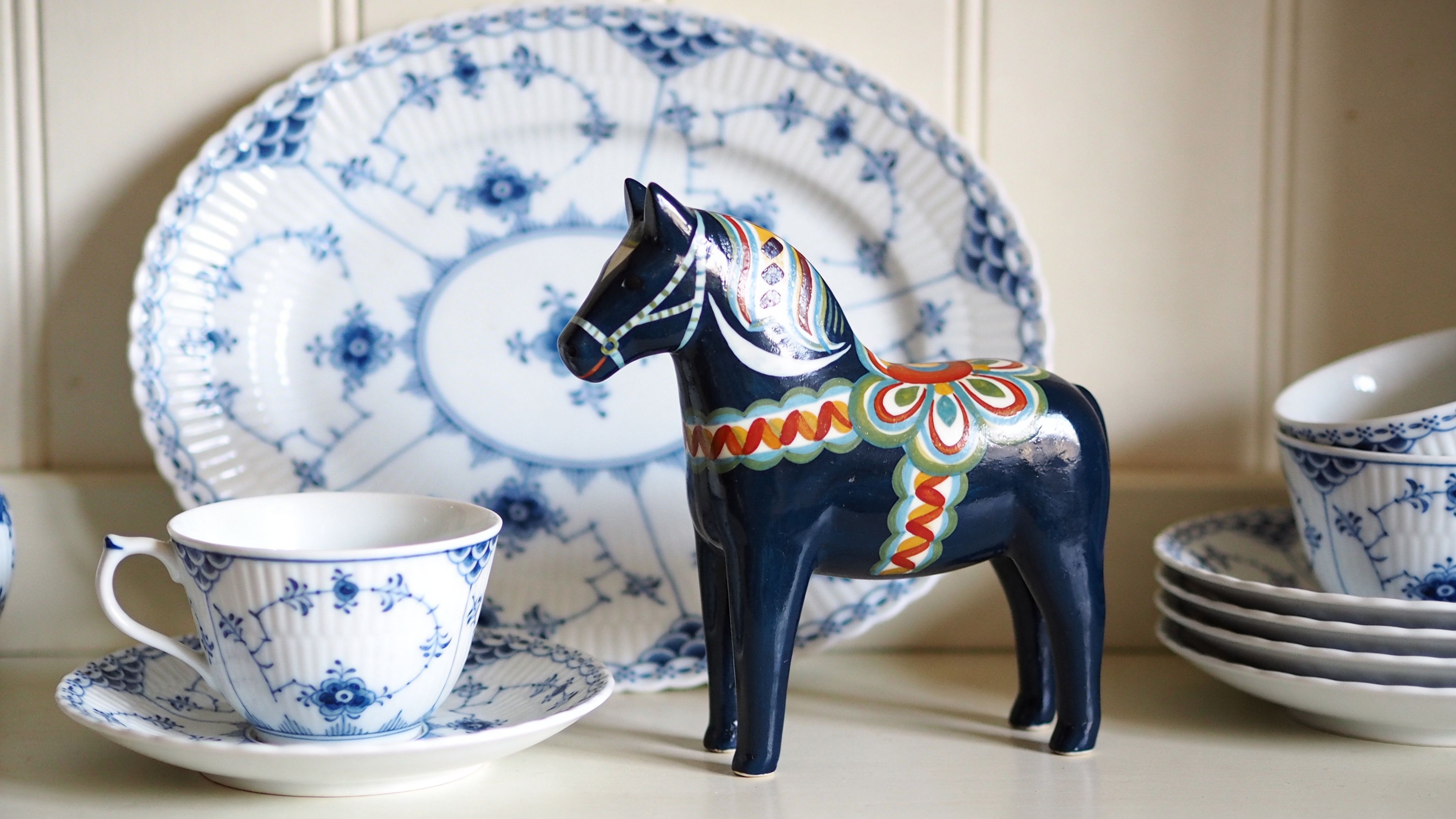
A friend once showed me a Blue Fluted plate she’d inherited from her grandmother. Next to it sat a small painted Dala horse, and the pairing felt so natural that it seemed they’d lived together forever.
Royal Copenhagen Blue Fluted has a way of changing how people look at porcelain. At first glance, many see a blue-and-white plate. Then they notice the hand-painted brushwork, the rhythm of the fluting, and the fact that no piece feels cold once it’s in a lived-in room.
That’s part of its hold. It belongs equally well on a formal table, in a glass cabinet, or on an open shelf beside everyday objects with family meaning.
The appeal starts with contrast. Blue Fluted is refined, but it isn’t stiff. The white porcelain feels bright and clean, while the cobalt decoration brings movement and softness.
Collectors often get confused here. They assume a famous porcelain pattern must be fragile in spirit, something to admire at a distance. In practice, Blue Fluted is better understood as a design language. It can look ceremonial, but it also suits ordinary life.
A teacup can make a weekday breakfast feel considered. A platter can anchor a sideboard without shouting for attention. A single plate hung on a wall can do the work of a framed print.
Blue Fluted endures because it carries history without looking trapped in the past.
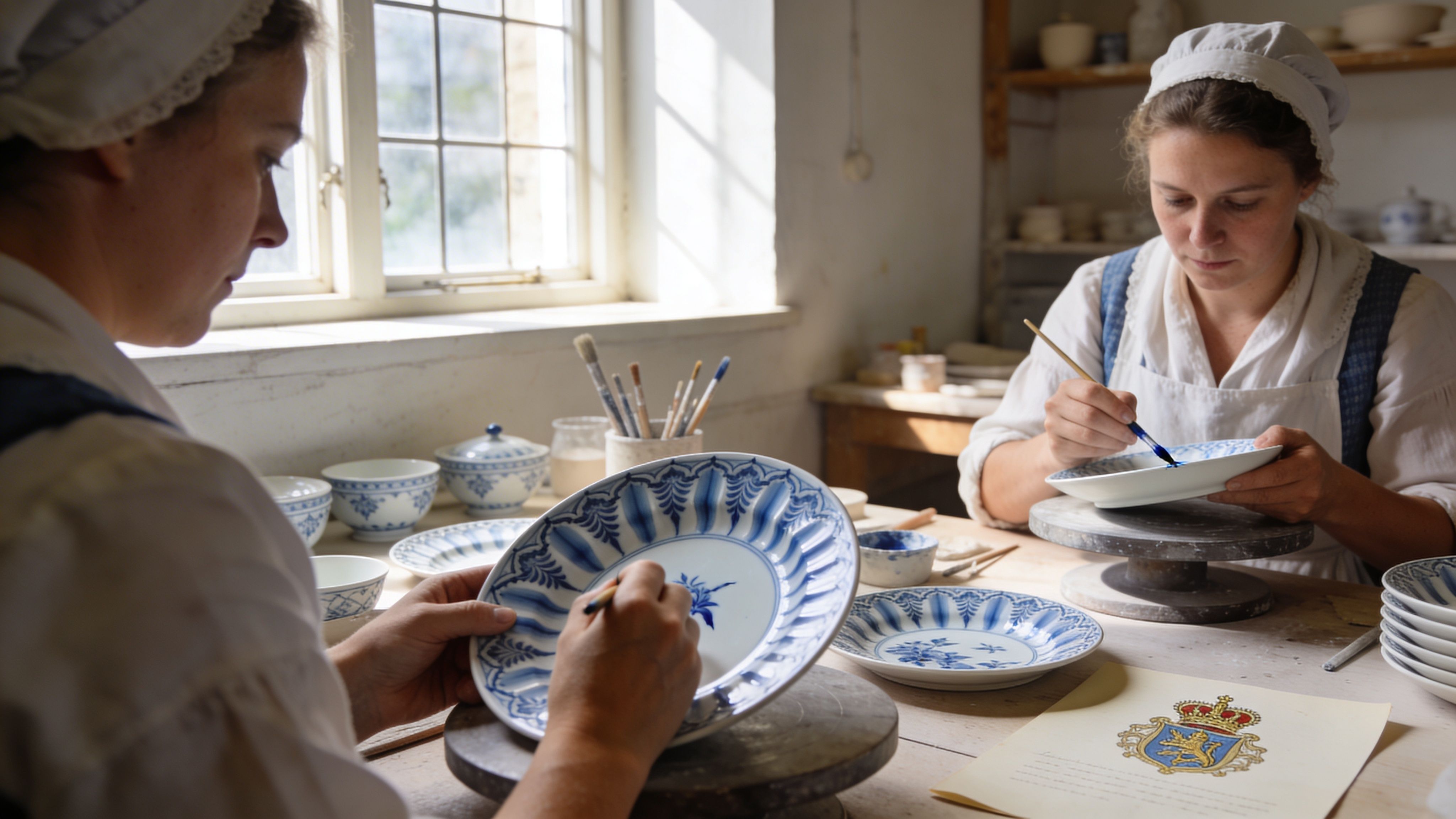
People also respond to the human touch. This isn’t a pattern that was merely printed and repeated until it lost character. Blue Fluted is tied to handwork, and you can feel that in the slight liveliness of the painted line.
That matters in Scandinavian design, where craftsmanship isn’t separate from beauty. The object should look good, work well, and age with dignity.
For readers who are new to royal copenhagen blue fluted, it helps to think of it as sitting at a crossroads:
The last point is often overlooked. Blue Fluted isn’t only for porcelain specialists. It also speaks to people who love carved wood, painted folk motifs, linen, candlelight, and the layered look of a Scandinavian home assembled over time.
That’s why it keeps finding new admirers. You don’t need a grand dining room to appreciate it. You just need an eye for objects that still feel alive after centuries.
On a Copenhagen table in the late eighteenth century, blue brushstrokes on white porcelain carried a message that went far beyond dinner. They announced that Denmark intended to make porcelain of its own, with its own symbols, its own discipline, and its own visual language.
The Royal Porcelain Factory was founded in Copenhagen in 1775 by chemist Frantz Heinrich Müller under the protection of Dowager Queen Juliane Marie. The factory received a monopoly to produce porcelain, and its first pattern was Blue Fluted, also called Musselmalet or Pattern No. 1. That starting point matters because the design was present at the birth of the institution itself. Blue Fluted was not a later success added to the catalogue. It was the opening chapter.
Blue Fluted has deep Danish identity, yet its story begins with movement across borders. European makers had long admired Chinese blue-and-white porcelain, and those wares helped set the visual terms for what refined porcelain could be.
Denmark did not copy that model directly. Danish makers translated it. The result became calmer in mood, more ordered in structure, and more tied to the fluted body of the porcelain itself. The decoration and the form work together, almost like melody and rhythm in the same piece of music.
That pattern of exchange is familiar across Nordic craft. Swedish folk painting also took ideas from trade, religion, and local custom, then reshaped them into something regionally distinct. Seen this way, Blue Fluted belongs to a larger Scandinavian habit of borrowing carefully and remaking confidently.
Turn a piece over and the underside begins to speak.
Royal Copenhagen’s mark of three wavy lines represents Denmark’s three main waterways: the Øresund, Storebælt, and Lillebælt. Once you know that, the mark feels less like a factory stamp and more like a small map. It ties the porcelain to a seafaring nation whose identity has always been linked to water, trade, and connection.
Collectors often learn the symbol before they learn the geography. The geography gives the symbol weight.
Because Blue Fluted was the inaugural pattern, it carried the pressure of first impressions. It had to show technical skill, artistic control, and royal credibility all at once.
Over time, the pattern moved from courtly settings into homes. That shift helps explain its unusual staying power. A design becomes culturally durable when it succeeds in both places: the formal table and the everyday cupboard.
This is also where Blue Fluted begins to connect beautifully with other Nordic traditions in a modern home. Danish porcelain brings structure and refinement. Swedish folk art, including painted wooden pieces and Dala motifs, brings warmth, color, and narrative. If you enjoy tracing those family relationships across Scandinavian table culture, our guide to Royal Copenhagen Star Fluted and its place in Danish table setting tradition adds another useful branch to the story.
Part of Blue Fluted’s character comes from the underglaze blue itself. Cobalt gives the decoration its clear, cool intensity, and underglaze painting gives the surface a depth that printed decoration rarely matches. The blue sits within the glaze rather than on top of it, which is one reason old pieces can still look so crisp.
The handwork matters just as much. Blue Fluted is painted by trained artisans, and that training shows in the line. A flower, tendril, or border detail may follow an established pattern, but the brush still records the painter’s hand. Slight variation is not a flaw. It is evidence of skill at work inside a tradition.
That idea can be surprisingly helpful for readers who also love Swedish folk art. A kurbits painter and a porcelain painter work in different materials, yet both depend on practiced repetition, controlled movement, and room for individual expression inside inherited motifs.
Blue Fluted became a Danish icon because several strengths came together in one object:
Many historic wares survive in museums. Fewer remain active in homes while still carrying that much symbolic force.
That is why Blue Fluted matters beyond collecting. It shows how Scandinavian design often works at its best. Foreign influence is absorbed, local skill gives it form, and everyday use keeps the tradition alive. In Denmark, that produced Blue Fluted. In Sweden, it produced parallel traditions of painted wood and folk ornament. Together, they tell a richer Nordic story than either one does alone.
Collectors often say they love Blue Fluted before they know which Blue Fluted they mean. That’s understandable. The family resemblance is strong, but the differences are important.
Some versions feel quiet and architectural. Others feel lace-like and romantic. One modern branch breaks the old pattern open and enlarges it until it reads almost like graphic art.
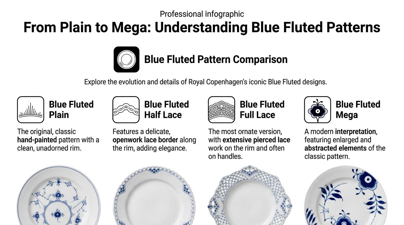
This is the original voice of the series. Blue Fluted Plain is the version often pictured when classic Royal Copenhagen Blue Fluted comes to mind.
The rim is clean, and the fluted body does much of the structural work. Because the edge isn’t heavily ornamented, the painted decoration has room to breathe.
Plain suits readers who like restraint. It works beautifully in homes where the surrounding elements already have texture, such as old wood, linen, woven runners, or painted folk pieces.
Half Lace adds delicacy without moving too far from the original. The border becomes more decorative, with openwork and a lighter sense of ornament around the rim.
This is often where newer collectors start to hesitate. Is it formal? Yes, but not only formal. Half Lace still feels usable and warm if you balance it with simpler surroundings.
A Half Lace cake plate on a plain shelf can look more modern than expected because the contrast is doing the work.
Full Lace is the most elaborate and often the most theatrical variation. It features the hand-pierced lace effect that many people associate with peak porcelain craftsmanship.
It’s easy to admire Full Lace and harder for some people to place it in a real room. The trick is not to surround it with too many competing flourishes.
A Full Lace coffee pot or serving dish often looks best when given visual space. Let it be the ornate note in an otherwise calm setting.
Blue Fluted Mega changed the conversation by refusing to treat heritage as something untouchable. According to Nordic Notes’ overview of Blue Fluted Mega, it was launched in 2000 by Danish ceramist Karen Kjældgård-Larsen. It began as a student project, debuted with six lunch plates, and grew to over 100 products, becoming one of the company’s biggest sellers.
Mega enlarges and fragments details from the old pattern. Instead of asking you to admire continuity from a respectful distance, it invites you to notice the parts. A flower head, a curve, a brushstroke. Everything is scaled up and sharpened for a more contemporary eye.
If you enjoy this kind of reinterpretation, you may also like seeing how other Royal Copenhagen families develop decorative language, such as Royal Copenhagen Star Fluted.
Some collectors choose Plain for continuity. Others choose Mega because it lets them enter the tradition without feeling bound by formality.
You don’t need to memorise every shape to know what belongs in your home. Start with mood.
There are also collectors who mix them. That can work well when one variation leads and the others act as accents.
A helpful way to think about these patterns is that they aren’t competing products. They are related dialects.
Plain speaks in a low voice. Half Lace dresses for dinner. Full Lace arrives with ceremony. Mega opens the windows.
That range explains why Blue Fluted keeps renewing itself. The core identity stays visible, but the expression changes enough to welcome different generations and different homes.
The fastest way to make a collecting mistake is to focus only on the front. The painting matters, but the underside often tells the clearer story.
Authenticating Blue Fluted means reading several clues together. No single sign should carry the whole judgement.
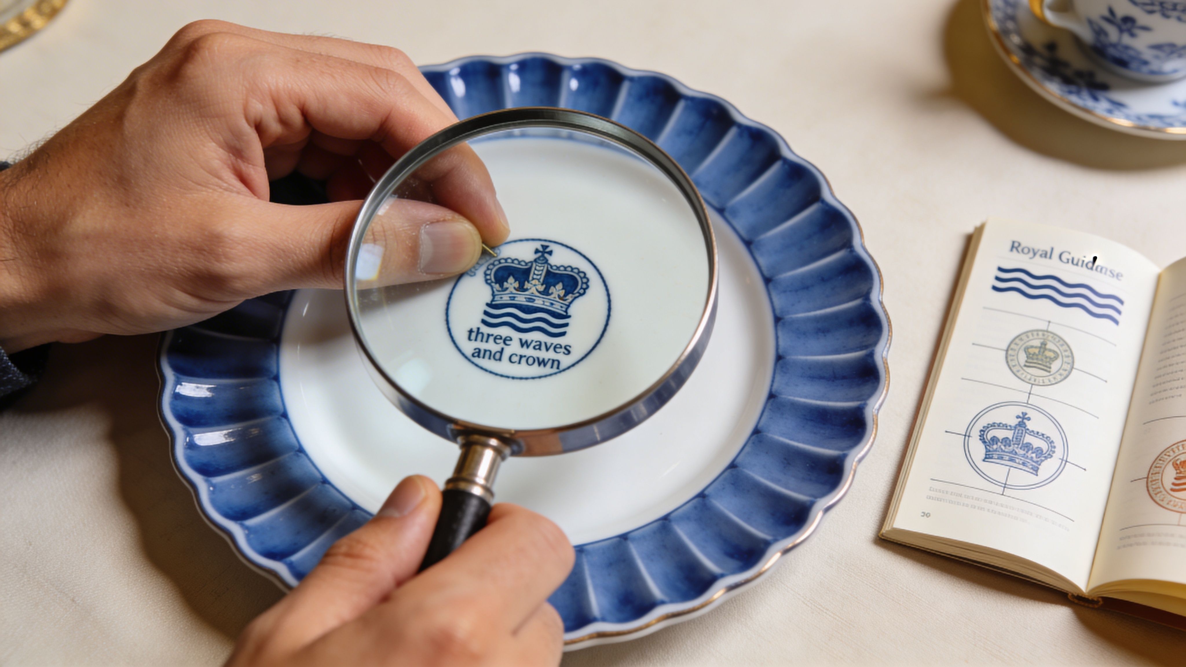
Turn the piece over first. Verified guidance notes that authenticity is confirmed by the painter’s signature under each piece alongside the three blue waves trademark, and that true Royal Copenhagen porcelain shows a translucency benchmark where light passes through the base at approximately 0.5 to 1 mm thickness. That same reference also notes that the high-fired formulation supports dishwasher and microwave safety. You can find that detail in the Royal Copenhagen Blue Fluted Plain product information at Dillard’s.
A genuine piece should feel coherent, not assembled from random marks. The signature, the waves, and the pattern information should belong together in a way that looks intentional and practised.
Collectors who struggle with Scandinavian maker names often find it helpful to keep a language reference nearby when sorting marks and terminology. A useful companion for broader regional terms is this Swedish English lexicon.
Use your eyes first, then your hands.
A painter’s signature isn’t decorative trivia. It points to the handmade nature of the object.
That’s where many readers get confused. They imagine a signature works like an artist’s signature on a painting, automatically making one piece more valuable than another. Sometimes it may matter to a collector, but its first job is authenticity and traceability.
Collector’s habit: Don’t ask “Is there a mark?” Ask “Do the marks, material, and painting quality agree with each other?”
One correct-looking wave mark doesn’t settle the matter. Neither does a convincing pattern from across the room.
Build your judgement from several layers:
If one layer feels wrong, slow down.
When you inspect a piece in person, take your time. Turn it in natural light. Look at the back before you admire the front.
If you’re buying from photographs, ask for a clear image of the underside and a close view of any wear. Collectors often lose confidence because they think expertise means instant recognition. It usually means patient comparison.
That’s good news. Authentication is a learnable skill.
A Blue Fluted piece can be historically interesting, visually beautiful, and financially modest all at once. Another can look similar and command much more attention from collectors. Value turns on details.
Condition is usually the first filter. Chips, cracks, hairlines, staining, and heavy repairs tend to change how people assess a piece. Even a small rim nick can shift a plate from collector interest to decorative use only.
Some factors are obvious. Others aren’t.
A practical point matters here. “Rare” is one of the most misused words in collecting. If a seller says it, ask what they mean. Rare because few were made, rare because the form is unusual, or rare because examples in good condition are hard to find? Those are different claims.
Care depends partly on age and partly on your own caution level. The verified product information notes dishwasher and microwave safety for true Royal Copenhagen porcelain because of its high-fired formulation, but many collectors still choose gentler treatment for older or more delicate pieces.
That’s not fear. It’s stewardship.
For regular care, keep to a few sensible habits:
Restoration can preserve a beloved object, but it won’t always preserve collector value. A professional repair may make a damaged family piece displayable again, which can be worthwhile for emotional reasons.
If your priority is collecting rather than sentiment, be honest about what restoration changes. A repaired object is still repaired.
Buy the best condition you can afford, then care for it so the next owner won’t have to ask what happened.
The healthiest approach is often neither museum fear nor careless use. Use sturdy pieces where appropriate. Display fragile or ornate ones where they’re safe.
Blue Fluted rewards owners who treat it as both art and household object. It was made to be part of life, but life goes better for porcelain when shelves aren’t overcrowded and washing-up isn’t rushed.
A Swedish farmhouse shelf can tell a larger Scandinavian story in a single glance. A Blue Fluted plate stands upright at the back. In front of it sits a painted Dala horse, all curve, colour, and village memory. One comes from Denmark’s porcelain tradition, the other from Sweden’s carved folk culture, yet the pairing feels settled rather than strange.
That harmony is not accidental. It grows from shared Nordic values: handwork, ornament with meaning, and objects made to live in real homes.
At first glance, Blue Fluted and Dalaart seem to speak different dialects. Royal Copenhagen porcelain is crisp, glazed, and controlled. Swedish folk art is warmer, more tactile, and often more playful in colour.
Look one layer deeper and the connection becomes clear.
Both traditions rely on painted surface decoration to carry identity. Both honour the hand of the maker. Both move easily between use and display. A Blue Fluted teacup is a functional object with artistic presence. A Dala horse is often decorative, yet it also carries regional history, family memory, and the visible marks of craft. They meet on common ground.
A useful comparison is music. Blue Fluted often plays the steady melodic line. Dalaart adds rhythm, accent, and warmth.
Design writers often discuss Danish porcelain and Swedish folk art separately, as if Scandinavian taste must stay inside national borders. Real interiors rarely work that way. Homes collect stories through inheritance, travel, gifts, and personal taste. A Danish plate beside a Swedish carved bird reflects how people live with objects.
That broader Nordic view matters. It helps you see the pairing as a relationship between craft traditions, not as a styling trick.
For readers interested in another Swedish blue decorative tradition, Blå Fågel from Rörstrand offers a helpful reference for how blue motifs can sit comfortably within Scandinavian interiors.
The arrangement usually goes wrong for one of two reasons. Either the display is so strict that the folk art loses its character, or it is so crowded that the porcelain loses its clarity.
Good styling starts with assigning roles.
Let one object lead. Let the other support. If you place a bright Dala horse with strong red and green patterning on a sideboard, Blue Fluted Plain can quiet the scene and give the eye a place to rest. If the porcelain piece is more ornate, such as a Full Lace bowl or serving dish, choose one or two smaller painted wooden objects nearby instead of a whole group.
This is the same principle used in textile rooms across Scandinavia. A patterned rya rug looks better when the surrounding furniture gives it space. Decorated objects need breathing room too.
Set a Blue Fluted platter or dinner plate at the back of an open shelf. Place a single carved horse, bird, or kurbits-painted object slightly in front of it and a little off-centre.
The porcelain works like a cool sky behind the warmer carved form. Add only one or two quiet supporting pieces, perhaps a linen-covered book or a simple glass vase. The goal is conversation, not competition.
Blue Fluted Plain is especially easy to use on the table because its pattern stays disciplined even when other elements become more expressive. A few small folk-art accents in the centre, perhaps carved animals or a painted candleholder, bring in Swedish warmth without disturbing the order of the place setting.
Guests often respond to this instinctively. They may not know the history of Danish porcelain or Dalarna carving, but they can feel the balance between refinement and welcome.
Glass-front cabinets can make porcelain look too formal when every piece inside is white, symmetrical, and glossy. One painted wooden figure changes the mood at once.
The contrast helps both materials show their strengths. The glaze looks smoother. The carved surfaces look more alive. The cabinet begins to feel curated rather than frozen.
Folk art and fine porcelain can strengthen each other. The result depends on spacing, scale, and restraint.
You do not need a rigid formula, but a few rules prevent visual confusion.
Scale deserves special attention. A miniature Dala horse on a large platter can feel witty and intentional. A bulky carved figure pressed beside delicate lace-edged porcelain can create tension for the wrong reason.
Each Blue Fluted variation changes the mood of the room.
Blue Fluted Plain is the easiest place to start. Its open pattern leaves visual space for carved and painted folk objects.
Half Lace suits softer arrangements, especially when the Swedish pieces are smaller or more finely painted. It has a gentle decorative edge that still leaves room for company.
Full Lace asks for restraint. The pierced border already carries a lot of visual activity, so pair it with one strong folk-art piece rather than several.
Blue Fluted Mega can be surprisingly effective. Its enlarged brushwork holds its own against bolder Swedish carving, especially in homes that mix old craft with cleaner modern furniture.
This combination reveals something larger about Nordic design. The region is not a set of sealed national boxes. Danish porcelain, Swedish folk painting, Norwegian textiles, and Finnish glass have always been seen, exchanged, and lived with across borders.
Placing Royal Copenhagen beside Dalaart respects that history. It shows how different Scandinavian traditions can speak to each other through material, skill, and painted ornament.
That is why the pairing feels so convincing when done well. It is rooted, personal, and richer than either tradition shown alone.
Blue Fluted endures because it solves a problem that many beautiful objects can’t solve. It offers history without heaviness.
Some heirloom designs ask too much of a room. They demand period furniture, formal habits, or a collector’s level of devotion. Royal Copenhagen Blue Fluted doesn’t. It can live with antiques, modern shelving, country wood, urban minimalism, and, as we’ve seen, Swedish folk art.
Another reason for its endurance is people still respond to visible skill.
A hand-painted object carries a different charge from something that looks mechanically perfect. You notice the care, even if you can’t name every technical step behind it. That response hasn’t disappeared in modern life. If anything, it has become more valuable.
Blue Fluted also keeps adapting without losing its identity. The original pattern remains compelling, while later interpretations let new buyers enter the tradition in their own way.
That balance is rare. Some collectibles become trapped behind glass because owners become frightened of them. Blue Fluted certainly includes pieces best handled with care, but the line as a whole still belongs to the table, the cabinet, the shelf, and the everyday visual life of a home.
That’s why it keeps passing between generations. A younger collector may not inherit the same habits as a grandparent, but they can still inherit the object and make it fit.
The deeper lesson is that classics survive when people keep finding honest uses for them. Blue Fluted has done that for centuries by being more than one thing at once:
The best Scandinavian objects don’t just decorate a home. They help a home tell the truth about who lives there.
Royal Copenhagen Blue Fluted remains relevant for exactly that reason. It doesn’t ask you to imitate the past. It asks you to care about craftsmanship, continuity, and the quiet pleasure of living with something made well.
If you’d like to bring that wider Scandinavian conversation into your own home, explore Dalaart for authentic Swedish Dala horses and companion folk-art pieces that pair beautifully with classic porcelain, vintage decor, and thoughtful Nordic interiors.


.svg)


.png)


