May 29, 2026
You're standing in a secondhand shop, fingers running along a rail of cotton. Most shirts feel forgettable. Then one stops you. The fabric is thin in a way new shirts rarely are. The print is faded, but not dead. The collar sits just a little differently. You don't just see an old T-shirt. You feel that it has lived.
That instinct is often where collecting begins.
A great vintage graphic tee works like folk art. It carries the marks of the hands, machines, tastes, and moments that made it. Its value isn't only in the image on the chest. It lives in the fabric weight, the seam, the softened ink, the evidence that someone once wore this to a concert, a rally, a summer job, or through ordinary days that have now become history.
A vintage graphic tee often looks modest at first glance. On closer inspection, it behaves more like a pocket-sized artifact. It can preserve the taste of a decade, the memory of an event, and the visual language of the people who wore it.
That is why these shirts attract more than casual nostalgia.
A band tee carries more than a logo. It can point to a tour route, a local venue, a fan scene, and the printing habits of its time. A charity run shirt can hold the memory of a town gathering. A souvenir tee can show how a place wanted visitors to see it. Even a promotional shirt from a long-closed company can reveal period typography, sales culture, and the bright confidence of a particular era.
Collectors respond to vintage tees for the same reason curators care about folk carvings, protest posters, or painted shop signs. Each object combines image, material, and use. You are not only looking at design. You are looking at evidence of daily life.
Three qualities often give a vintage tee its lasting pull:
That last idea helps explain why the form became so culturally powerful. As printing methods improved and shirt decoration became cheaper to produce at scale, the T-shirt changed from plain underlayer to public message board. By the late twentieth century, the graphic tee had become a popular surface for music, politics, tourism, advertising, and personal belonging.
Vintage clothing asks a different question from fashion retail: what has survived, and why?
People often confuse vintage with retro, and the distinction matters. A retro shirt is newly made in an older style. A vintage shirt was present in the period it represents. One references history. The other carries it in its fabric, print, and wear.
That is the soul of a vintage graphic tee. It is clothing, but it is also record, souvenir, announcement, and witness.
The quickest mistake in this field is trusting one trick. A single-stitch sleeve alone won't save you from a clever reprint, and a modern tag alone won't always condemn a shirt if parts have been altered. Authentication works best when you build a case from several physical clues.
In Sweden, one of the strongest practical approaches is to focus on construction era, older tags, and print wear such as cracking or fading. That matters because public advice is often uncertain. In one example, a creator admitted they were “not too sure” about the single-stitch rule they had “read on the Internet”, which shows how anecdotal much online guidance can be in this YouTube discussion of vintage tee authentication.
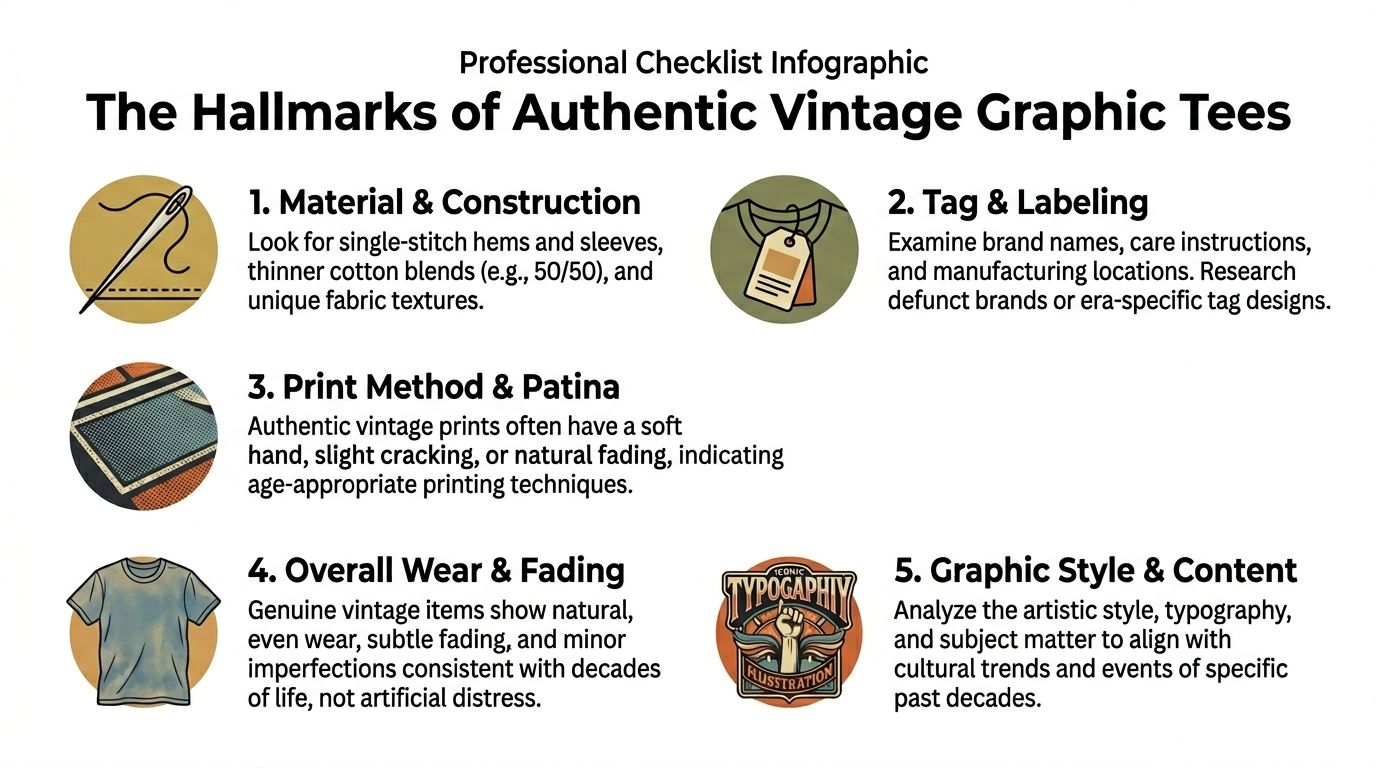
Look first at the hems and sleeves. Older tees often show simpler construction. The stitching can look less engineered, less uniform, and more direct than on many newer mass-market garments. If the shirt has lived a long life, the seams may also tell you how it moved and wore.
Single-stitch construction gets so much attention because it can be useful. But treat it as supporting evidence, not a final verdict. Reproduction makers know collectors look for it.
Tags are often tiny time capsules. The brand name, the material feel, the typography, and the manufacturing information can all help place a shirt within an era.
When you examine a tag, ask:
A collector's mistake is expecting a tag to function like a passport stamp. It usually doesn't. It's one witness among several.
Older cotton often feels different from modern, heavier retail blanks. It may feel softer, thinner, and more broken in, especially if it has been washed for decades. The hand-feel should make sense with the garment's apparent age.
The print deserves just as much attention. Authentic older screen prints often settle into the cloth rather than sitting as a thick, plastic layer on top. Wear can appear as gentle cracking, soft fade, or a slightly uneven patina. That kind of surface change is not automatically damage. In many vintage tees, it is part of the appeal.
Practical rule: Don't ask whether the shirt is worn. Ask whether it is worn in a way that matches its supposed age.
Artificial distress often gives itself away. The fading may be too localised, the cracking too decorative, or the shirt may feel old in one area and suspiciously fresh in another.
Natural ageing usually looks quieter. The collar, underarms, shoulders, and print tend to age together. The whole garment tells one consistent story.
A reliable check is to pause and look at the shirt from a distance before studying details. Does everything agree? Construction, print, fabric, and wear should feel as though they belong to the same life.
You pull a shirt from a rack at a flea market. The image looks right for the period. The cotton feels lived in. Then a closer look changes the question from “Do I like this?” to “When was this made, and what world produced it?”
That shift matters. A vintage graphic tee belongs to a specific moment in design history and manufacturing history at once. The artwork reflects the taste of its era, but the object itself also carries evidence of the tools, inks, blanks, and production methods available at the time. Read carefully, a shirt works like a dated poster printed on cloth.
The timeline below helps place that evolution visually.
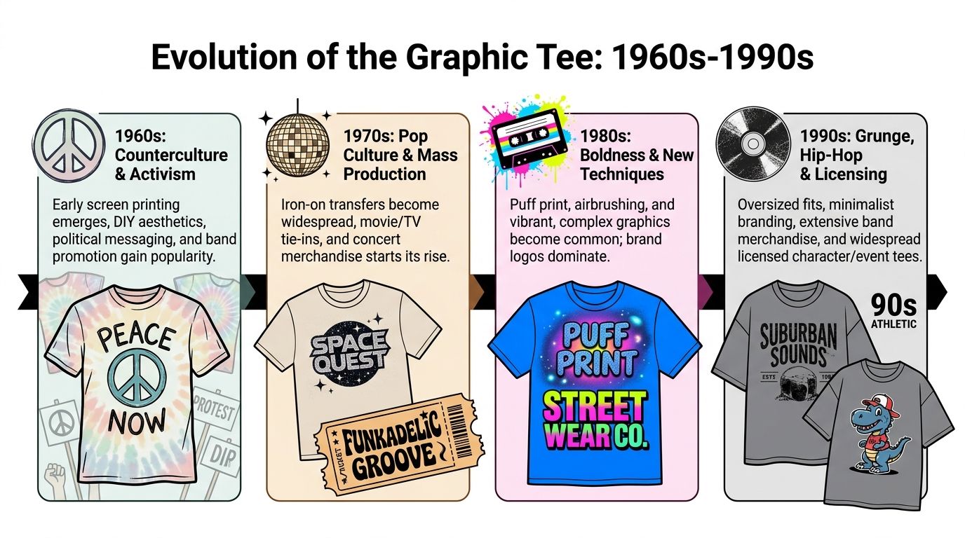
Graphic tees became culturally powerful once printing grew durable, repeatable, and affordable enough for wider circulation. As noted earlier in the article, production advances helped move the T-shirt from underwear and workwear into a public medium. That history explains why shirts from different decades do not merely look different. They were made under different practical limits.
Earlier graphic tees often speak in a clearer voice. Many use a single focal image, straightforward typography, and fewer competing elements. The message had to carry the shirt. A political slogan, camp souvenir, local fair design, or early band promotion often relied on one strong visual idea rather than a crowded composition.
Collectors sometimes mistake simplicity for plainness. It often signals the opposite. Earlier shirts can feel restrained because the design was serving communication first, with fewer printing effects and fewer layers of branding.
That is part of their historical charm. They preserve a time when the shirt functioned less like a mini billboard and more like a hand-distributed notice that happened to be wearable.
Readers interested in how printed images move from public communication into collectible culture may enjoy this look at Keith Haring posters as printed cultural artifacts. The parallel is useful because tees and posters both record how an era wanted to be seen in public.
As graphic tees spread through music, sports, tourism, streetwear, and mass retail, the visual language grew bolder. Logos got larger. Layouts became denser. Color contrast sharpened. Some designs were built to catch the eye across a venue, a shopping mall, or a concert queue in a split second.
This short film adds useful visual texture to that evolution.
A practical way to place a shirt in time is to read three clues together:
One clue rarely settles the question.
A shirt usually dates itself through agreement. The graphic style, the print method, and the cut should belong to the same historical moment. If the artwork suggests one decade but the body shape suggests another, pause and investigate further. Good collectors learn to read that kind of mismatch the way a curator reads a frame around a painting. The object and its presentation should make sense together.
That is how vintage tees become more than old clothes. They become records of changing taste, changing technology, and changing public identity, preserved in cotton and ink.
Two shirts can be the same age and still live in entirely different value worlds. One might be a charming old souvenir. Another might be a serious collector's piece. Age helps define the category, but age alone doesn't create significance.
A widely used retail benchmark says a T-shirt is typically considered vintage if it is at least 20 years old, which means shirts from 2006 or earlier qualify in 2026. The same source notes the broader graphic-tee market could reach $10.17 billion in 2024, while the print-on-demand segment is projected to rise from $6.34 billion in 2022 to $67.5 billion by 2032, which helps explain why authentic older pieces stand out as scarce pre-digital artefacts in this overview of graphic tee history and market context.
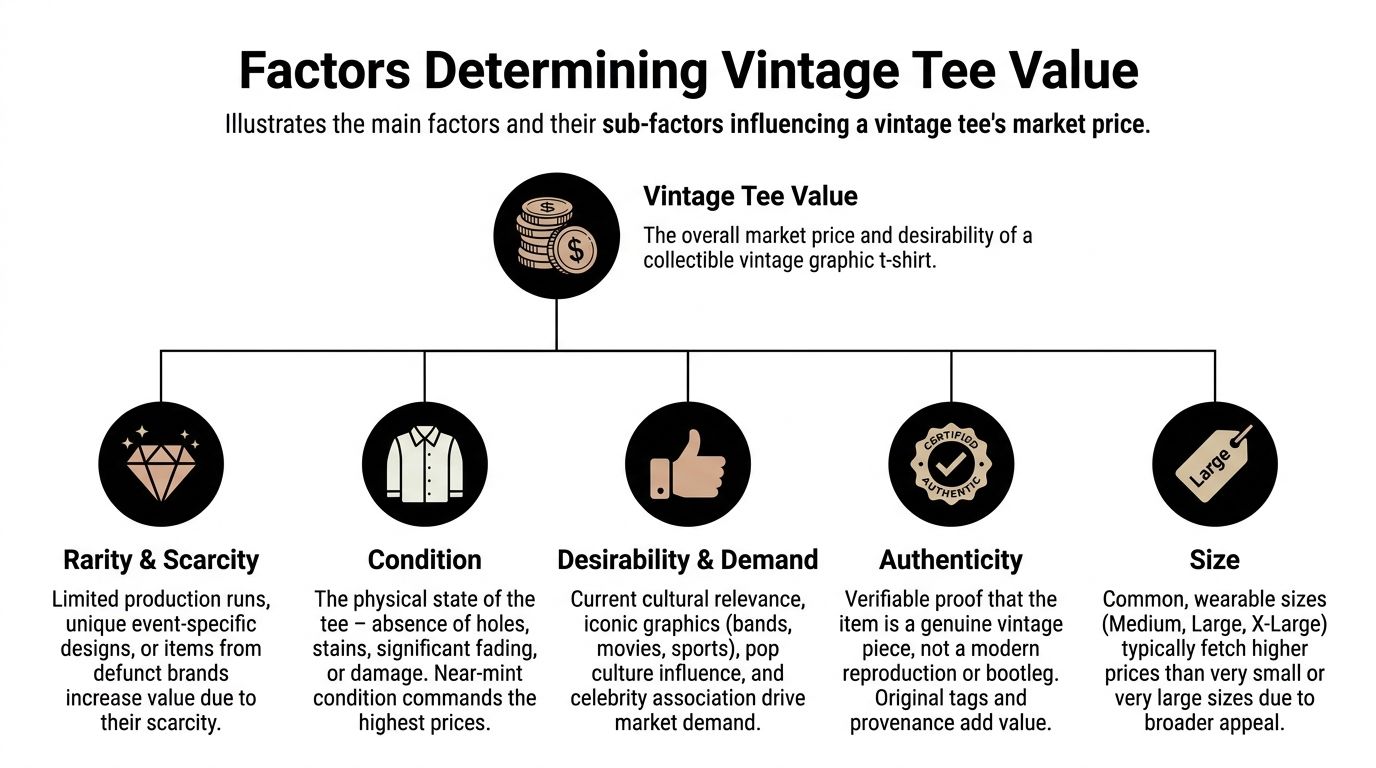
Collectors usually weigh several factors at once.
Collectors often struggle here. A faded print can be attractive. So can a soft collar, a mellowed body colour, or minor signs of age that confirm a shirt's life. But heavy staining, severe fabric weakness, major tears, or crude repair work can limit desirability.
The key is whether the ageing deepens the shirt's character or compromises the garment itself.
A useful test is to imagine the shirt in a collection. Would you describe the wear as evidence, or as loss?
Provenance means the supporting story around the object. It might include where it was found, who owned it, what event it came from, or how confidently it can be tied to a known place and time.
The most memorable vintage tees don't just show an image. They preserve a chain of meaning.
That doesn't mean every collectible shirt needs a dramatic backstory. Many don't. But when provenance exists, it can sharpen both confidence and appreciation. A shirt with a believable history often feels less like stock and more like an artefact.
Owning vintage graphic tees comes with a quiet responsibility. These garments weren't made to survive forever, and cotton doesn't forgive rough treatment. If you collect them, you become their caretaker for a while.
The first rule is simple. Wash less often, and wash more gently. Many old tees don't need routine laundering after every wear if they've only been handled, briefly tried on, or displayed.
Use the least aggressive method that solves the problem. For many shirts, that means cool water, light hand-washing, and a mild detergent. Avoid harsh stain attacks unless the stain threatens the garment more than the treatment would.
A good preservation habit is to test your cleaning approach on an inconspicuous area first. Older prints can react unpredictably, and weakened fibres may not tolerate scrubbing.
If you're unsure, leave the shirt alone until you've examined it properly. Collectors often do more damage through over-cleaning than through patient caution.
Wire hangers are hard on shoulders and collars. Heavy shirts can stretch if hung for long periods, and fragile cotton may distort under its own weight.
For most vintage graphic tees, safer storage looks like this:
For collectors who appreciate ageing in other objects as well, there's a useful parallel in vintage digital cameras. Different materials age differently, but stewardship follows the same principle. Preserve use without accelerating decay.
Minor seam separation can often be stabilised with careful hand sewing. But repairs should support the garment, not overwhelm it. Thick thread, aggressive patching, or modern shortcuts can make a vintage tee feel less honest.
Sometimes the best conservation choice is non-intervention. A shirt doesn't need to look new. It needs to remain legible, stable, and true to itself.
A strong collection shouldn't disappear into storage boxes. Vintage graphic tees were made to be seen, read, and enjoyed. The challenge is to honour their age without turning them into costume.
The easiest styling mistake is over-theming. If the shirt already carries visual force, let it do the talking.
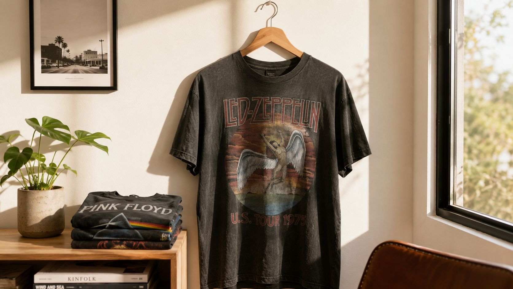
A good vintage tee often works best when the rest of the outfit stays quiet. Plain denim, simple trousers, worn leather, soft knitwear, and unbranded outerwear all give the graphic room to breathe.
Think of the shirt as the focal object, much like a carved folk piece placed in a minimal interior. You don't need to surround it with other loud references from the same decade.
A few styling approaches work especially well:
Some tees cross the line from wardrobe item to display object. Maybe the print is rare, the fabric is too fragile, or the image has become central to your space. When that happens, display can be more respectful than wear.
Framing is the most formal route. Done properly, it turns the garment into textile art rather than bedroom memorabilia. Even simple display methods improve when you think like a curator. Protect from direct light, avoid pressure on weak areas, and support the fabric evenly.
For inspiration on integrating printed heritage into interiors, vintage posters in Sweden offer a related design language. The same room can happily hold framed paper ephemera and a well-presented shirt if both are given enough visual space.
A displayed tee should still feel like a garment with a life behind it, not a flattened logo.
The best collections move between use and appreciation. Some shirts are worn. Some are studied. Some become part of the home.
Not every old shirt can remain a shirt. Some become too fragile under the arms, too torn at the neck, or too worn across the body to survive normal use. That doesn't mean their stories are finished.
A damaged tee can still contribute its image, fabric, and history to a new form. The goal isn't to erase age. It's to preserve what still matters.
When the graphic remains strong but the body doesn't, selective reuse can be a respectful option.
Consider these approaches:
Upcycling works best when you choose shirts that are already compromised. Cutting apart a sound, authentic vintage tee for casual craft use usually destroys more history than it saves.
Sometimes you don't want an original. You want to create a modern shirt that pays tribute to the old visual language. That's a different craft, and it benefits from technical discipline.
Industry guidance recommends artwork at at least 150 DPI and no more than 300 DPI for apparel printing, since going above 300 DPI doesn't materially improve print quality but does increase file size, according to Printful's guide to making vintage T-shirts. The same guide explains that the vintage effect often comes from controlled grain, halftone treatment, reduced saturation, and limited colour values that mimic older screen prints.
A convincing vintage-inspired design usually avoids looking too polished.
Focus on these design choices:
Many modern retro designs fail because they imitate damage rather than process. Good vintage-inspired work understands why old prints look the way they do. It respects ink behaviour, cloth texture, and the limits of earlier production methods.
A collector's eye helps here. If you've handled enough authentic vintage graphic tees, you start recognising the difference between homage and costume.
If you're drawn to objects that carry history in their materials, Dalaart is worth exploring. Its world of hand-carved and hand-painted Swedish folk art shares the same appeal as a great vintage tee. Authentic craft, visible human touch, and the kind of provenance that turns an object into a story you can live with.


.svg)


.png)


